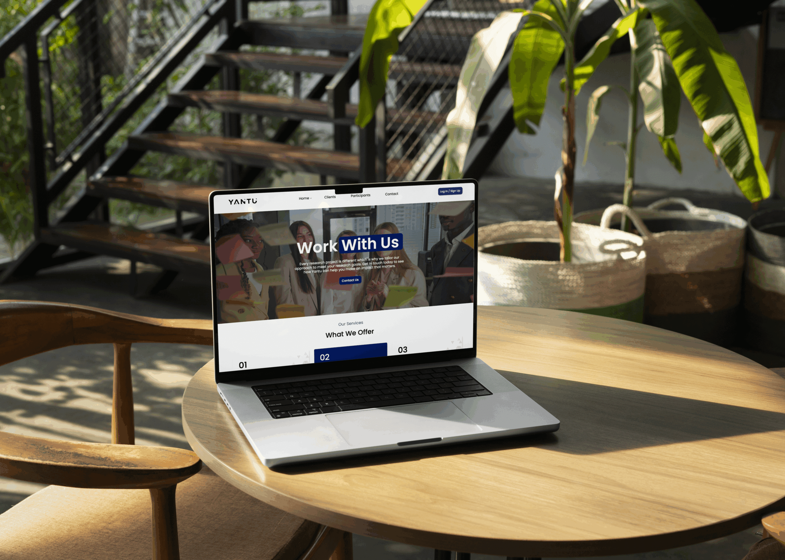
The design concept developed by Mutatio for Yantu focused on a clean, modern aesthetic that reflects the organisation’s dedication to accessibility and support for individuals with diverse needs.
Our goal was to craft a minimalist layout that leverages generous whitespace and bold, impactful visuals to convey the quality and professionalism of the individuals Yantu represents.
The design was intentionally inclusive and user-friendly, ensuring that it would appeal to both the talent and the organisations Yantu collaborates with—encouraging meaningful engagement and enquiries from both audiences.
Visual Identity & Art Direction
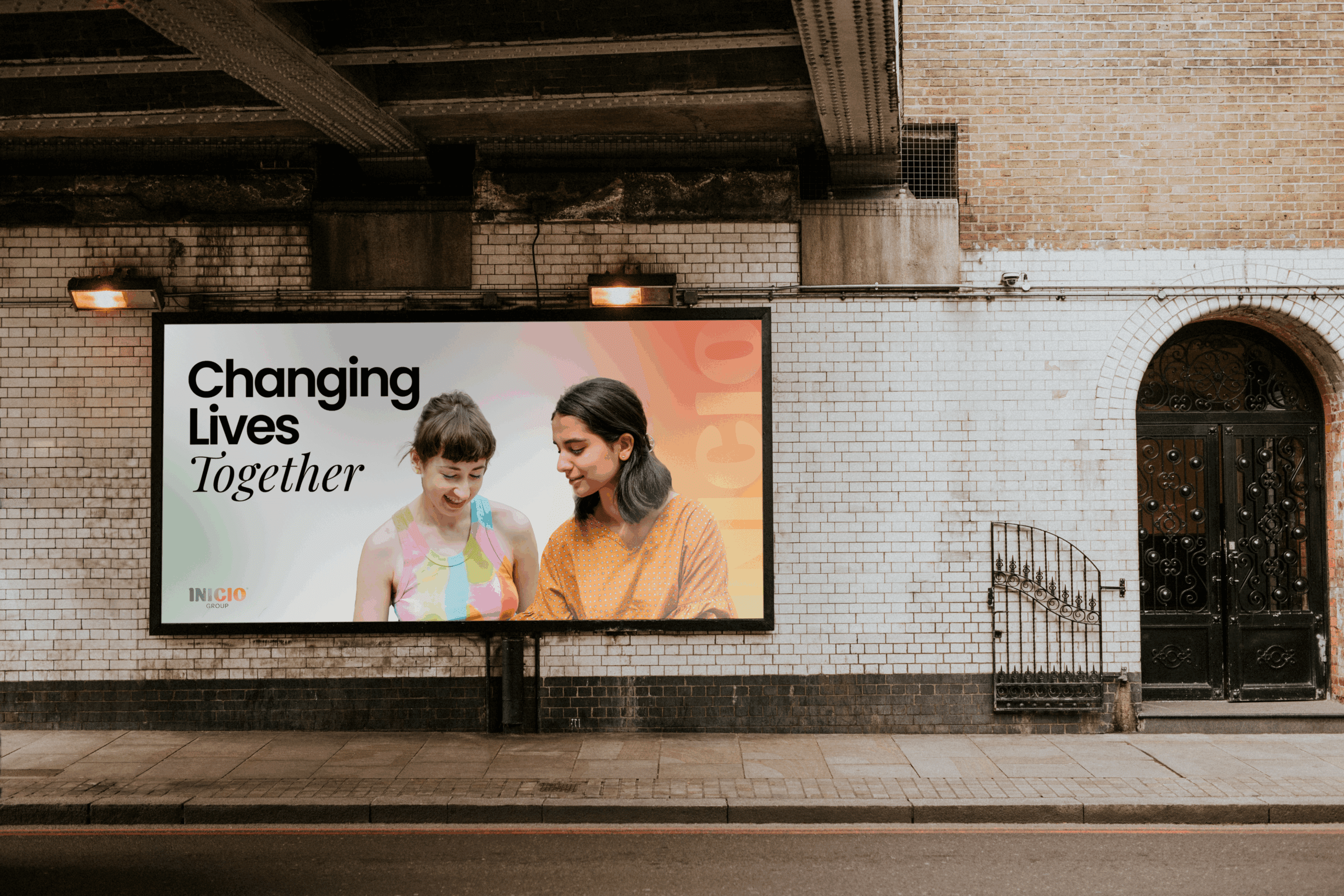
The visual identity for Yantu was designed with accessibility at its heart—reflecting their mission to support individuals with a range of access needs. The art direction combines bold minimalism with thoughtful design restraint, ensuring that every element serves a clear, inclusive purpose.
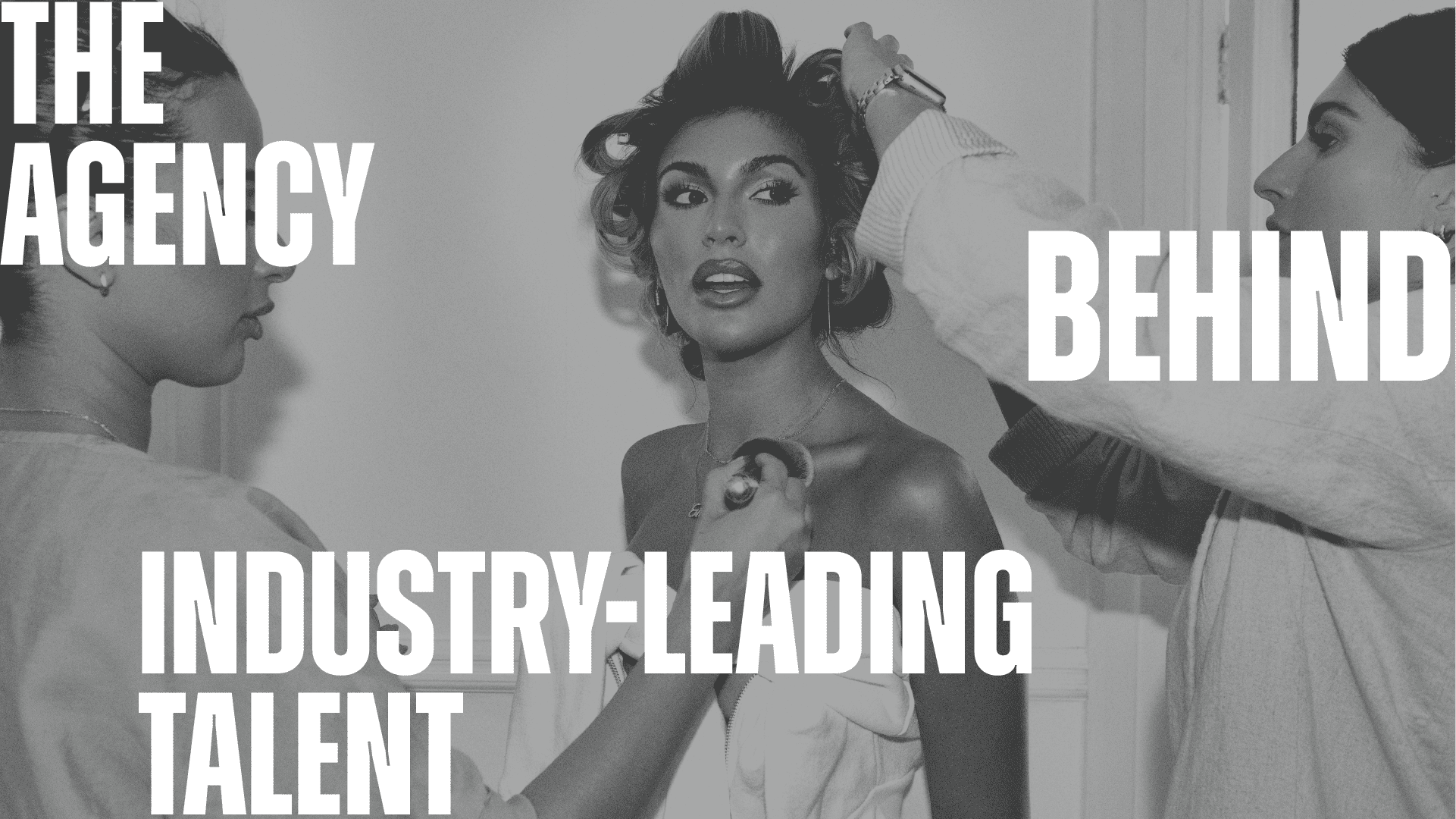
Large, clean visual elements were used throughout the site to support clarity and legibility. The layout embraces negative space to prevent visual overcrowding, and natural imagery was carefully chosen to reflect Yantu’s human-centered ethos.
Colour was handled with particular attention to accessibility. We conducted thorough checks to ensure that the palette chosen meets WCAG standards and is appropriate for users with colour vision deficiencies. The result is a design that is both visually impactful and inclusive—modern, sleek, and accessible to all.
Yantu’s site conveys energy and professionalism while remaining easy to use and approachable. The colour scheme, imagery, and typography all align to create a unified aesthetic that supports both form and function for a wide range of users.
Accessibility was the cornerstone of the user experience strategy for Yantu’s website. Recognising that their audience includes individuals with diverse accessibility needs, the site was designed to be bold, clean, and incredibly easy to navigate—without unnecessary complexity or visual noise.
We implemented a minimalist structure to reduce cognitive load and distractions, making key sections such as talent profiles, podcasts, and agency information easy to locate and consume. Navigation flows seamlessly, with clearly defined paths and intuitive layout choices that prioritise clarity.
Colour contrast and text hierarchy were rigorously tested to ensure optimal legibility, particularly for colour-blind users. Typography choices support readability, while generous whitespace and consistent formatting make the browsing experience smooth and undistracted.
High-resolution imagery paired with concise, meaningful copy draws attention to the core offerings without overwhelming the page. This visual strategy keeps users engaged while maintaining a sense of calm and order throughout their journey.
The overall experience is polished but welcoming—supporting both the emotional and practical needs of users, and helping Yantu build trust, clarity, and lasting connection through every interaction.
The website created for Yantu is a powerful reflection of their values: accessibility, clarity, and bold simplicity. Every design decision—from colour selection to structural layout—was grounded in the goal of making the digital experience inclusive and intuitive for all users.
Through a clean and minimalist interface, bold visual elements, and accessible design standards, the site ensures ease of navigation without sacrificing aesthetic impact. Colour choices were validated for accessibility and colour-blind compatibility, supporting Yantu’s commitment to inclusive design.
Ultimately, Yantu’s new website delivers a sleek, functional, and empathetic user experience—one that speaks directly to their audience and reinforces their brand’s purpose of elevating and representing talent with dignity and accessibility in mind.
Brilliant from start to finish. The team listened to what we wanted and added their own creative flair. The end result is a sleek, high-performing website that’s already paying off
– Yantu

Manchester
82 King Street