Smooth Competitions Web Design Blog

Smooth Competitions: Designing a Digital Brand That Moves

Crafting a Bold, Immersive Experience for a Leader in Competitive Events

Overview

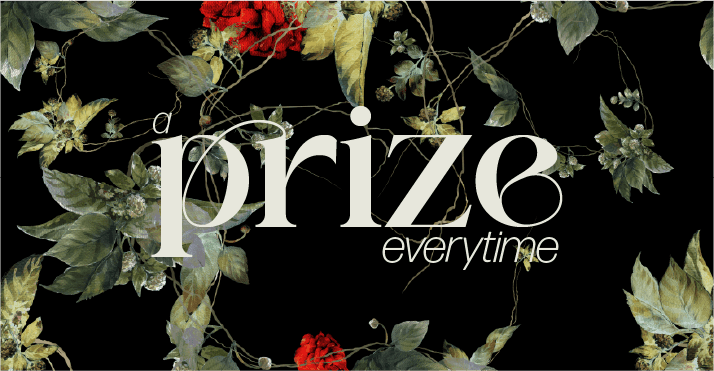
Smooth Competitions Web Design wasn’t just about building a website — it was about crafting a digital stage. A space that radiated energy, clarity, and the competitive pulse the brand is known for. The goal was clear: bring their dynamic, high-stakes identity to life online in a way that felt modern, elevated, and unmistakably them.

Rooted in crisp execution and expressive movement, the Smooth Competitions Web Design project focused on building a seamless, branded environment that could tell their story, support their services, and resonate with everyone — from event organizers to elite competitors.


Project Goals

From the beginning, the Smooth Competitions Web Design objectives were well-defined by the Mutatio team:

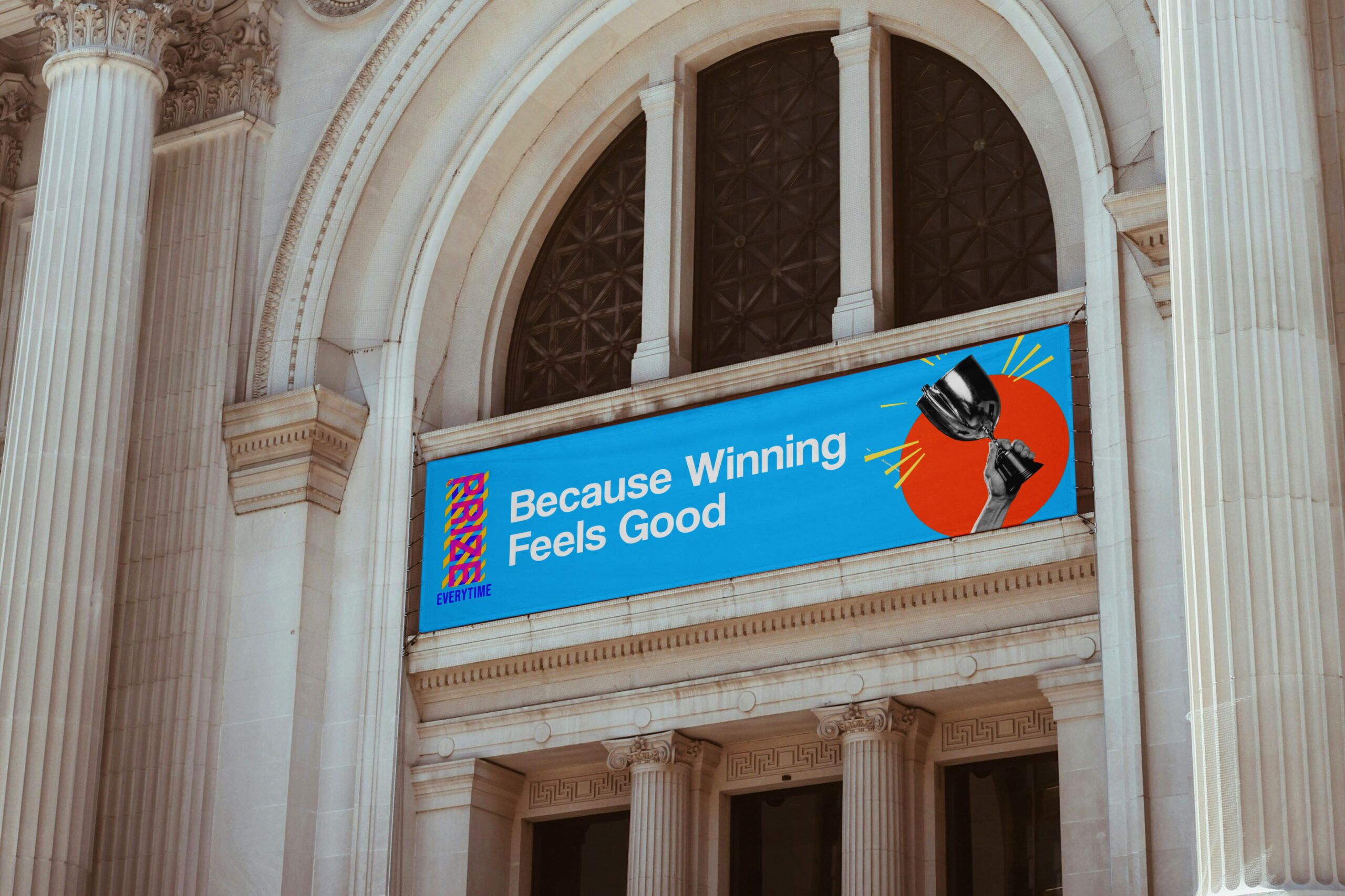
  • Create a bold, modern website that reflects their energy and professionalism

  • Develop an engaging intro video graphic to immediately captivate visitors

  • Ensure seamless consistency across platforms — from mobile layouts to social content

This wasn’t just about aesthetics. The Smooth Competitions Web Design strategy centered around translating their ethos — dynamic yet grounded, energetic yet trustworthy — into a digital experience that could scale and adapt.

Moodboard: A World of Depth, Focus, and Calm

The visual inspiration for the Smooth Competitions Web Design leaned into clarity, sophistication, and focus — blending strong structure with inviting warmth.

  • Colour Palette: Deep blue, beige, and white — a palette that reflected both authority and calm.

  • Texture & Flow: Crisp edges and soft transitions gave the design a confident, polished feel.

  • Tone: Understated confidence paired with functional elegance guided the visual language of Smooth Competitions Web Design.

Designers Insight

“For Smooth Competitions, we wanted the experience to feel like stepping onto a well-lit stage — focused, exciting, and unmistakably intentional.”

Colour System: Deep Blue, Beige & White

The colour palette was central to the emotional tone of the Smooth Competitions Web Design system:

  • Deep Blue (#002F6C): A stable, trustworthy base used in key site elements

  • Beige (#F5F0E6): Adds sophistication while softening the overall tone

  • White (#FFFFFF): Opens up space and clarity for content and visuals to breathe

Used together, these colours support a brand identity that is as strong as it is approachable — a key component of Smooth Competitions Web Design.

Typography: Confident, Clear, Contemporary

Typography in Smooth Competitions Web Design played a major role in shaping tone and usability. The typographic system was designed to guide users clearly while reinforcing brand strength.

  • Refined Serif: For headlines — adding composure and elegance

  • Neutral Sans-Serif: For body text and UI — ensuring clarity and adaptability

The pairing helped maintain rhythm and pacing across every screen size, keeping Smooth Competitions Web Design consistently user-friendly and visually aligned.


Logo Design: Structured Motion

At the center of the visual system was a logo that reflects structure, movement, and forward momentum — all core to Smooth Competitions Web Design.

  • Shape Language: Geometric and directional, echoing the competitive spirit

  • Typography: Bold and clean, expressing clarity and confidence

The result is a brand mark that adapts across print, motion, and web — perfectly suited for the multi-platform nature of Smooth Competitions Web Design.

Final Design System: Where Energy Meets UX

The end result of the Smooth Competitions Web Design project was more than a website — it was a functional, living brand system designed to scale and evolve.

  • Responsive UI: Mobile-first layouts that still feel rich on desktop

  • Narrative Flow: Pages and videos structured to guide users from curiosity to action

  • Visual Consistency: Every scroll animation, hover state, and transition unified under a single voice

This phase of Smooth Competitions Web Design wasn’t just execution — it was an intentional architecture of experience.

Design Challenges

Every bold brand walks a tightrope: how to communicate intensity without overwhelming users. For Smooth Competitions Web Design, that meant capturing the fast-paced nature of competitive events — but slowing the digital layer just enough to educate and convert.

The solution? A modular system. From hero banners to service pages, each component was designed for flexibility and flow. By pairing expressive style with user-driven logic, Smooth Competitions Web Design delivers an experience that’s both exciting and digestible.

Conclusion: Designing with Intent and Impact

The Smooth Competitions project is a testament to how clarity, motion, and tone can coalesce into a brand experience that feels dynamic, yet trustworthy.

Through a rich but restrained palette, strategic typography, and emotion-led layout, the digital identity now mirrors the real-world spirit of the brand — commanding without shouting, guiding without pushing.

It’s a site that doesn’t just inform — it invites. And most importantly, it sets the stage for competition that feels elevated, exciting, and smooth.

Testimonial Quote

Scott Whitecross

Keep Reading

A Prize Everytime Concept 3

a prize everytime

A Prize Everytime Concept 2

a prize everytime

A Prize Everytime Concept 1