Bold & Bright Identity for a New Concept by Mutatio for Malka Livingstone

Mutatio Creative presented two resonating concepts in the development of Malka Livingstone’s brand identity, each embodying unique dimensions of the brand’s aspirations and ethos

The “Bold & Bright” concept features the most creative typography, colorful scheme, and logo design. This idea is inspired by the ethos of warmth and resilience Malka Livingstone aspires to reflect, especially in the delicate area of domestic abuse training and consultancy. In this one, we take a look at how the mood board, font, colour scheme, and logo elements all work on this brand concept to build an identity that is welcoming yet business-like.

Mood Board: An Emotive, Warm and Energetic Palette

The mood board for the “Bold & Bright” concept sets the stage for a brand that presents as accessible while still being authoritative. Mutatio Creative crafted a visual palette that reflected optimism, accessibility and stability embodying the core values that make up Malka Livingstone.

The mood board shows a majorly balanced mix of rich, deep teal with light neutrals and bright pops of coral and bold orange. These options help support an inviting, solutions-oriented brand atmosphere that speaks to Malka Livingstone’s mission of offering compassionate, hands-on assistance in difficult scenarios.

Every piece of content on the mood board serves to create a cohesive message of resilience and professionalism — reassuring clients that they will always be understood and supported from the onset of any engagement.

Designers Quote

The branding for Malka Livingstone had to balance stability, growth, and energy, while keeping it welcoming, approachable and friendly. It’s modern, professional, and designed to resonate with a broad audience

Font Choice: Accessibility with Sora and Professionalism with Montserrat

Typography is an integral part of any brand communication and for this design, Mutatio Creative chose two versatile typefaces: “Sora” and “Montserrat.” Sora, the primary font for the wordmark and most main brand messaging, was selected for its clean lines and approachable rounded shapes that give it clarity and warmth. The Sora has a nice design that toes the line between professionalism, but still comes off approachable, making it a perfect fit for a brand in the domestic abuse training and consultancy industry. For body text, Montserrat pairs well with Sora for high readability and a geometric aesthetic that improves the legibility of the brand both in print and on screen. All three fonts complement each other and, as a cohesive unit, help to reinforce Malka Livingstone’s commitment to the inclusion of clarity, professionalism, and accessibility in communication.

Potent Palette: A Marriage of Stability and Hope

With a highly emotional impact for each make-up shade, the colour scheme of the “Bold & Bright” concept has been chosen with great care. The dominant colour (which is dark teal) grounds the brand in stability, professionalism and trust. This is certainly the case of the consultancy who advises on sensitive and complex issues and would be a vote of confidence showing a reassuring presence. Touching hues of bold orange and coral add a note of warmth and a feeling of approachability to the palette, which carries optimism and approachability without undermining the letter of brand teachings. This combination yields a balanced aesthetic that feels at once sturdy and welcoming, mirroring the emotional support that the brand provides to its clients.

Logo Idea: A Step Forward with a Unique Typography and Icon

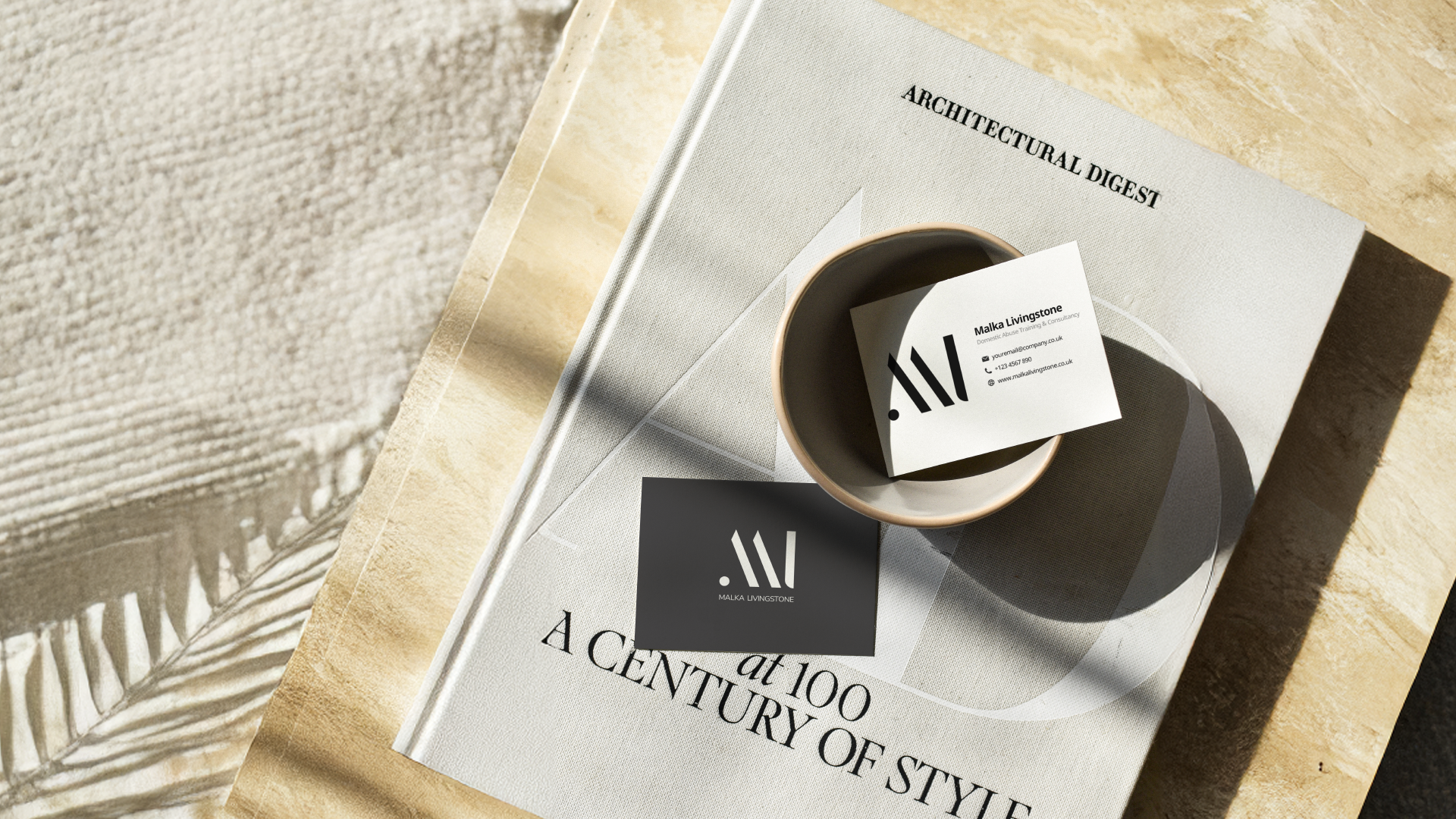
For visual brand identity through logo, we used a wordmark that can showcase the full name of brand, distancing ourselves from an initial based logo. It maintains consistency, recognizability, and reinforces the credibility and trust associated with the complete name. The stripe identity is a unique iconmark that can be used independently to create a distinctive brand presence in multiple contexts, giving the logo a versatility and adaptability without sacrificing brand cohesion. In fact, this wordmark and iconmark choice is especially advantageous for Malka Livingstone as it creates a gender-neutral, professional aesthetic that is relatable to most, allowing for memorability and coherence across all digital and print mediums.

Where We Started: Market Research

Market research was an essential aspect in crafting the branding for Malka Livingstone. We started our journey by coming to know about the needs of the target audience, which consists of organisations, professionals, and individuals who need systematic training on how to help those experiencing domestic abuse in a suitable manner. By conducting competitor analysis, we discovered several major gaps in the market including a need for approachability and inclusivity in training platforms. This research also uncovered a need for sensitivity, professionalism, and clarity in messaging and branding that ensures the topic is treated with the gravitas it warrants.

We also examined how audiences preferred to search for information within online learning environments, finding that simplicity and ease of use were key to retention. Trust, authority, and empathy matter to prospective clients, too. These insights informed our development of tone and visual identity that would speak to people, as well as inspire confidence in Malka Livingstone’s training programmes. We also ensured that by harmonising the branding with the expected goals that the messaging would cater to audiences at all levels of understanding domestic abuse.

The Impact of the Market Research on the Created Branding

The branding developed for Malka Livingstone was directly influenced by the market research. The website is filled with soft, friendly colours and accessible typography to promote a feeling of safety and approachability. The tone used throughout is professional but also empathetic, mirroring the brand’s commitment to be informative and supportive. Moreover the accessible design makes the courses easily available and proves the brand’s commitment to inclusivity and empowerment. This branding not only enhances Malka Livingstone’s digital representation, but also establishes the company as a compassionate and authoritative force in domestic abuse training.

The branding idea for Malka Livingstone is the best blend of market research, creativity and goal

We undertook extensive research to better grasp the sensitive nature of the subject matter and the qualifications of prospective professionals looking to participate in domestic abuse training. This notion was key in developing a brand that represents not only professionalism but compassion, trust, and approachability. From finding the right tone of voice to make sure the visual elements helped support the company’s mission, every decision along the way was intentional and supported by data.

To Conclude

The entire concept of branding embodies the spirit of Malka Livingstone’s values and goals.

The clean, calming design and user-friendly navigation make the platform feel open and accessible to its audience. The choice of soft colour palette, modern typography as well as empathetic messaging helps reinforce the nature of the supportive training on offer. In addition, the website had been built as an extension of the brand’s mission to empower individuals and organizations through knowledge and insights — not just as a learning platform.

As a result, the branding strategy has enhanced Malka Livingstone’s identity, distinguishing it as a leading figure in domestic abuse training. This shows the strength that comes from pairing research with innovative design to create true and effective brand. The brand has established itself as a go-to source for supplemental training by creating an emotional and visual tie to its audience. With this robust framework, Malka Livingstone will be able to reach a wider audience, foster meaningful change, and assist professionals with informed and compassionate education.

Keep Reading

Capitalize Ltd Market Research by Mutatio – Take Your Business to New Heights

The Green Peace Branding Concept by Mutatio Creative Ltd

Getting to Know Creatr’s Brand Vision