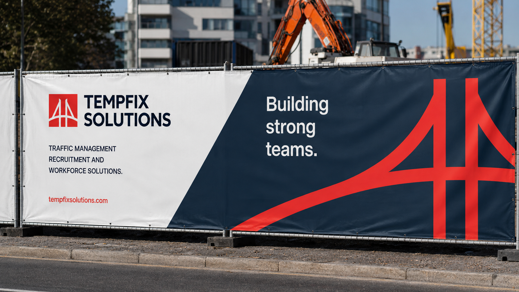
Workforce Solutions Branding for Tempfix Solutions Ltd: Concept 1

Project Scope: Modern Workforce Solutions Branding for Tempfix Solutions Ltd

Objective

This concept focuses on developing a clear, confident and highly recognisable workforce branding identity for Tempfix Solutions Ltd.

The creative direction positions Tempfix as a dependable partner for traffic management, recruitment, construction support and specialist workforce solutions. The objective was to communicate reliability and operational expertise while creating an identity that feels contemporary, approachable and capable of supporting the company’s continued growth.

Rather than relying on the conventional visual language often associated with recruitment and traffic management businesses, the concept introduces a more refined and design-led approach. Bold typography, a distinctive dotted graphic device and a focused colour palette work together to create Workforce Solutions Branding that feels professional, energetic and immediately recognisable.

The central message, “Right people. Right place. Right time.”, captures the value Tempfix delivers: providing dependable workforce solutions exactly when and where they are needed.

Target Audience

Tempfix Solutions Ltd serves organisations requiring dependable people, specialist skills and responsive workforce support.

The target audience includes construction companies, infrastructure contractors, traffic management providers, project managers, procurement teams and organisations responsible for delivering complex projects safely and efficiently.

These customers need more than temporary labour. They require a workforce partner that understands compliance, safety, availability and the operational pressures associated with time-sensitive projects.

The Workforce Solutions Branding therefore needed to communicate:

  • Professionalism and credibility
  • Speed and responsiveness
  • Safety and reliability
  • Access to specialist personnel
  • Confidence in project delivery

The identity is designed to appeal to decision-makers who value clear communication and dependable service while also presenting Tempfix as an attractive and professional organisation for prospective employees and contractors.

Brand Identity

The identity is built around three core principles: people, movement and reliability.

People

People are central to the Tempfix offer. The identity communicates the company’s ability to connect clients with skilled professionals who can support projects across traffic management, construction and specialist workforce requirements.

Movement

The visual language reflects progress and momentum. The triangular dotted graphic creates a sense of direction, coordination and forward movement, reinforcing the brand’s role in helping projects remain operational and on schedule.

Reliability

Strong typography, structured layouts and concise messaging create a dependable and professional impression. The branding is deliberately clear and uncomplicated, reflecting a company that understands its responsibilities and delivers practical solutions.

Together, these principles form a Workforce Solutions Branding system that feels purposeful, modern and relevant to the industries Tempfix supports.

Deliverables

The concept presents a complete Workforce Solutions Branding direction designed to perform consistently across digital and physical environments.

The proposed deliverables include:

  • Primary and secondary logo variations
  • Brand icon and supporting graphic devices
  • Colour palette and typography system
  • Brand guidelines
  • Website design direction
  • Social media and digital advertising assets
  • Recruitment campaign materials
  • Outdoor advertising
  • Site hoarding and construction graphics
  • Branded workwear
  • Business cards and stationery
  • Presentation and document templates
  • Vehicle and equipment branding

The identity has been designed as a flexible system rather than a standalone logo. This allows Tempfix to maintain a consistent brand presence across recruitment communications, client presentations, project environments and public-facing campaigns.

Tone and Messaging

The tone of voice is direct, dependable and confident.

Tempfix operates within industries where speed, safety and clarity are essential. The messaging therefore avoids unnecessary complexity and focuses on the practical value the company provides.

The headline language is concise and action-focused, using messages such as:

  • Right people. Right place. Right time.
  • Workforce solutions that keep projects moving.
  • Keeping projects moving forward.
  • People. Safety. Performance.

These statements help the Workforce Solutions Branding remain consistent across recruitment campaigns, client communications and project-focused advertising.

The wider tone remains professional but approachable. Tempfix should sound knowledgeable and experienced without becoming overly corporate or impersonal.
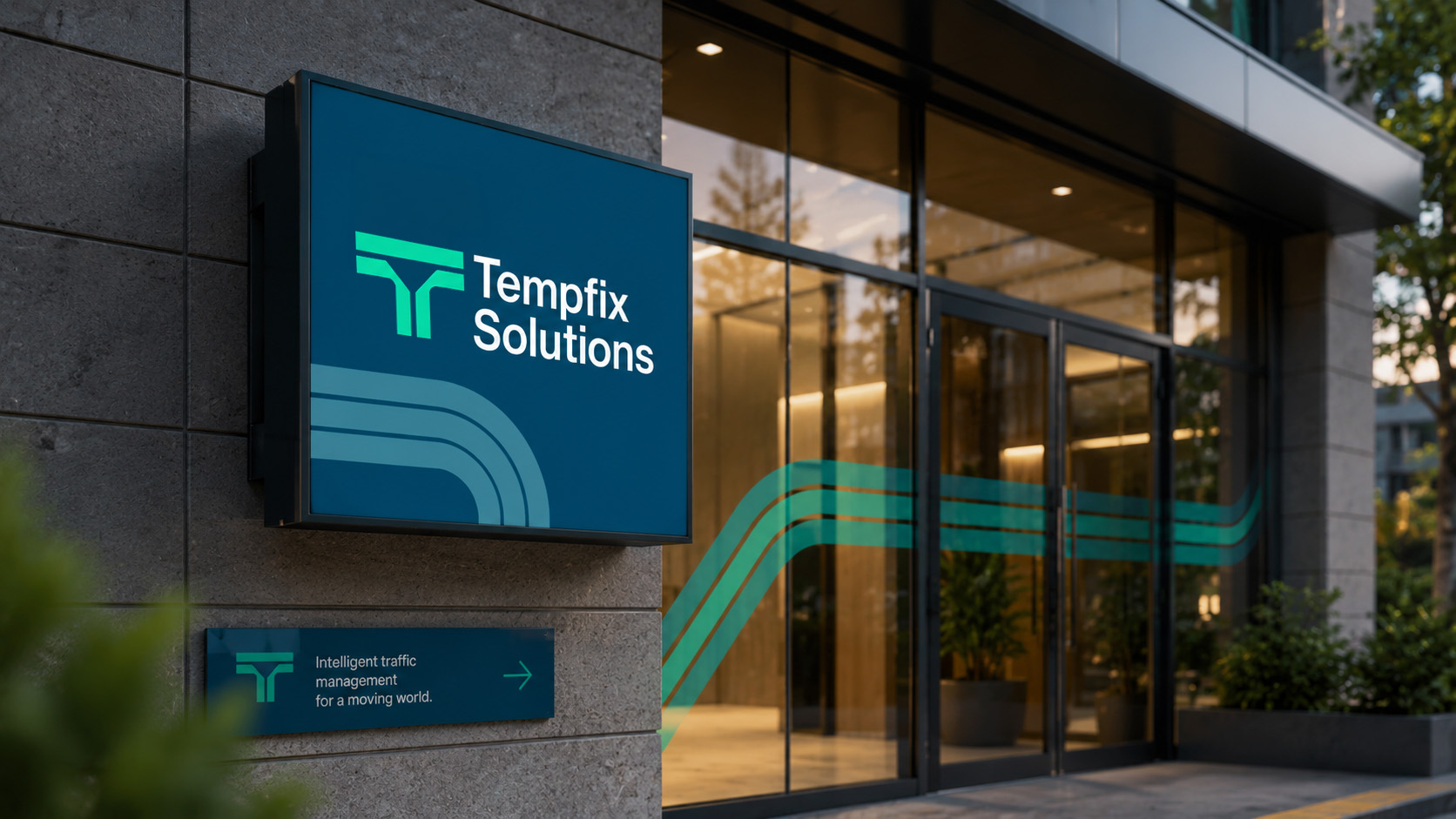
Mood Board for Tempfix Solutions: Precision-Led Workforce Solutions Branding

The mood board explores a confident and contemporary visual direction inspired by movement, coordination, infrastructure and workforce connectivity.

This Workforce Solutions Branding concept combines structured layouts with bold typographic messaging and a distinctive dotted pattern. The result is an identity that feels organised and professional while retaining enough energy to remain visually engaging.

The overall direction avoids visual clutter. Instead, it uses space, contrast and repeated graphic elements to establish a clear and memorable brand system.

Colours

The palette is built around vivid orange, deep charcoal, soft grey and clean white.

Orange introduces energy, visibility and movement. It also connects naturally with the high-visibility environments associated with traffic management and construction without depending on conventional industry imagery.

Charcoal creates a strong and professional foundation, while white and light grey provide balance, clarity and breathing space.

Typography

Typography is clean, modern and confident.

Large headlines provide immediate impact, while a highly legible supporting typeface allows longer information to remain accessible across websites, documents and advertising.

The contrast between strong headline typography and simple body copy gives the brand a clear visual hierarchy.

Imagery

Imagery focuses on active projects, transport infrastructure, road environments and the people responsible for keeping work moving.

Photography is cinematic and purposeful, showing real operational contexts rather than generic recruitment imagery. Warm lighting and orange highlights create a connection with the brand palette while reinforcing themes of urgency, coordination and progress.

Textures and Patterns

The dotted triangular pattern is the defining graphic element within the concept.

Its structure suggests a collection of individual people working together as one coordinated workforce. The narrowing and expanding formations also create movement and direction, allowing the device to be adapted across stationery, advertising, clothing and digital interfaces.

Logo Inspiration

The logo combines a modern wordmark with a distinctive triangular symbol created from repeated dots.

The individual dots can represent people, skills, locations or project resources. When brought together, they form a strong and unified shape, reflecting Tempfix’s ability to organise the right workforce around a client’s requirements.

The symbol is simple enough to remain recognisable at small sizes while also providing a powerful graphic device for large-scale applications.

Designers Quote

“The Tempfix Solutions identity was built around the idea of structure in motion, transforming a simple geometric form into a dynamic visual system that reflects the flow of people, projects, and progress. The triangular mark, constructed from individual points, represents a workforce coming together to create strength, momentum, and precision. Paired with a refined typographic palette and a bold, industrial-inspired colour system, the brand communicates confidence, reliability, and forward movement across every touchpoint.”

— Stephanie Sweeney, Creative Director, Mutatio

Colour Scheme for Tempfix Solutions

The colour palette has been developed to communicate visibility, confidence and professionalism within the wider Workforce Solutions Branding system.

Vibrant Orange — Primary Accent

Orange is the most distinctive colour within the identity.

It communicates energy, movement and responsiveness while providing a visual connection to construction, traffic management and high-visibility working environments.

Used strategically, it draws attention to important messaging, calls to action and graphic details without overwhelming the wider design.

Primary orange: #E25A03

Deep Charcoal — Core Brand Colour

Deep charcoal provides the principal foundation for the brand.

It creates a strong, premium appearance and supports the company’s professional positioning. It is particularly effective across outdoor advertising, workwear, stationery and digital applications where orange and white elements require strong contrast.

Charcoal: #232122

Soft Grey — Supporting Neutral

Soft grey introduces balance and structure.

It can be used for secondary backgrounds, content sections and supporting brand materials, allowing the identity to remain clean without relying entirely on white space.

Soft grey: #EBEBE8

Clean White — Clarity and Accessibility

White provides clarity and keeps layouts feeling open and accessible.

It supports readability across websites, presentations and corporate documents while giving the orange and charcoal elements maximum visual impact.

White: #F7F7F7

Together, these colours create a distinctive Workforce Solutions Branding palette that feels relevant to Tempfix’s industries without becoming predictable or overly industrial.

Font Selection for Tempfix Solutions

Typography plays an important role in establishing Tempfix as a confident and contemporary workforce partner.

Space Grotesk — Headline Typeface

Space Grotesk has been selected for headlines and prominent brand messaging.

Its geometric structure creates a strong and modern appearance, while its distinctive proportions give the identity personality. It performs particularly well in large statements such as:

Workforce solutions that keep projects moving.

The heavier weights provide authority and impact, while lighter styles can be used for supporting messages and campaign communications.

Inter — Body Typeface

Inter is used for body copy, interface elements and detailed information.

It provides excellent readability across digital and printed formats, making it suitable for websites, recruitment information, reports and operational documents.

The combination of Space Grotesk and Inter creates a balanced typographic system: expressive enough to establish a recognisable identity but practical enough to support everyday business communications.

Logo Design for Tempfix Solutions

The Tempfix Solutions logo has been developed around the idea of individual components forming a coordinated whole.

The triangular symbol is constructed from a series of orange dots. Each dot can represent a person, skill, placement or project resource. Together, they form a clear directional shape that communicates organisation, momentum and collective performance.

This idea gives the Workforce Solutions Branding a strong visual story: individual capabilities working together to create collective performance.

The accompanying wordmark is simple and highly legible. Its clean construction ensures the name remains clear across website headers, uniforms, social media profiles, business cards and outdoor advertising.

The logo can be used in several configurations:

  • Full symbol and wordmark
  • Stacked logo
  • Horizontal logo
  • Standalone symbol
  • Single-colour reproduction
  • Reversed white version
  • Orange and charcoal version

This flexibility allows the branding to remain consistent across applications of every scale.

Final Concept Board for Tempfix Solutions

The final concept board brings together the principal components of the Workforce Solutions Branding identity.

It demonstrates how the logo, colour palette, typography, website, advertising, workwear and stationery can operate as one connected visual system.

Logo System

The primary logo combines the dotted symbol with a clear and modern wordmark. The central black application establishes a confident brand presence, while alternative configurations provide flexibility across different formats.

Colour Palette

Orange, charcoal, grey and white create a high-contrast palette that feels professional and energetic. The colours remain effective across both corporate communications and active project environments.

Typography

Space Grotesk introduces character and impact, while Inter provides clarity for body content and functional information.

Website Application

The website demonstrates how the identity can support a clear and modern digital experience. Strong headlines and structured service navigation communicate the Tempfix offer quickly.

Environmental Branding

The construction hoarding application shows how the symbol can be enlarged and repeated to create a distinctive physical presence.

Workwear

The uniform application demonstrates how the identity can remain recognisable in a restrained and professional format.

Together, these components create a Workforce Solutions Branding system that is consistent, adaptable and capable of supporting Tempfix across every customer and employee touchpoint.

Challenges of Branding Tempfix Solutions

One of the key challenges was creating a professional identity that represented several connected services without making the brand feel fragmented.

Tempfix supports organisations through traffic management, construction assistance, recruitment and specialist workforce solutions. The identity therefore needed to establish one clear brand position while providing enough flexibility to communicate individual service areas.

Another challenge was differentiating Tempfix from competitors that frequently use similar industry imagery, colours and messaging. The dotted symbol offers a more distinctive approach, representing people and coordination rather than relying solely on conventional road, helmet or construction graphics.

The identity also needed to balance authority with accessibility. Clients must view Tempfix as dependable and experienced, while potential employees should see the company as approachable and supportive.

Consistency across very different environments presented an additional consideration. The brand must perform equally well on a mobile screen, a formal letter, a uniform and a large construction hoarding. The simplified palette, flexible logo system and repeatable graphic pattern help maintain recognition throughout these applications.

Finally, the branding needed to communicate speed and responsiveness without suggesting that safety or quality had been compromised. The structured layouts and professional typography establish control and reliability, while the orange accents and directional graphics introduce movement.

Conclusion

Concept 1 presents Tempfix Solutions Ltd as a modern, dependable and highly coordinated workforce partner.

The identity communicates the company’s ability to bring the right people, skills and resources together to keep projects moving safely and efficiently.

Through its distinctive dotted symbol, confident typography and focused colour palette, the Workforce Solutions Branding concept establishes a recognisable identity that can perform consistently across websites, recruitment campaigns, workwear, site environments and corporate communications.

The central message brings the entire direction together:

Right people. Right place. Right time.

It is a clear expression of the Tempfix offer and provides a strong foundation for future campaigns, business development and long-term brand recognition.

This direction also gives Tempfix Solutions Ltd a strong foundation for developing future communications without losing consistency or recognition. As the company expands its services and reaches new clients, the Workforce Solutions Branding can evolve across campaigns, digital platforms and operational environments while continuing to communicate the same core values of reliability, coordination and professional delivery.

Keep Reading

Infrastructure Workforce Branding

Infrastructure Workforce Branding for Tempfix Solutions Ltd: Bridge & Build

Sports Wear Branding

Concept 2: Performance-Driven Sports Wear Branding for Sports Trend

Sports Wear Branding

Concept 1: Modern Performance Sports Wear Branding for Sports Trend