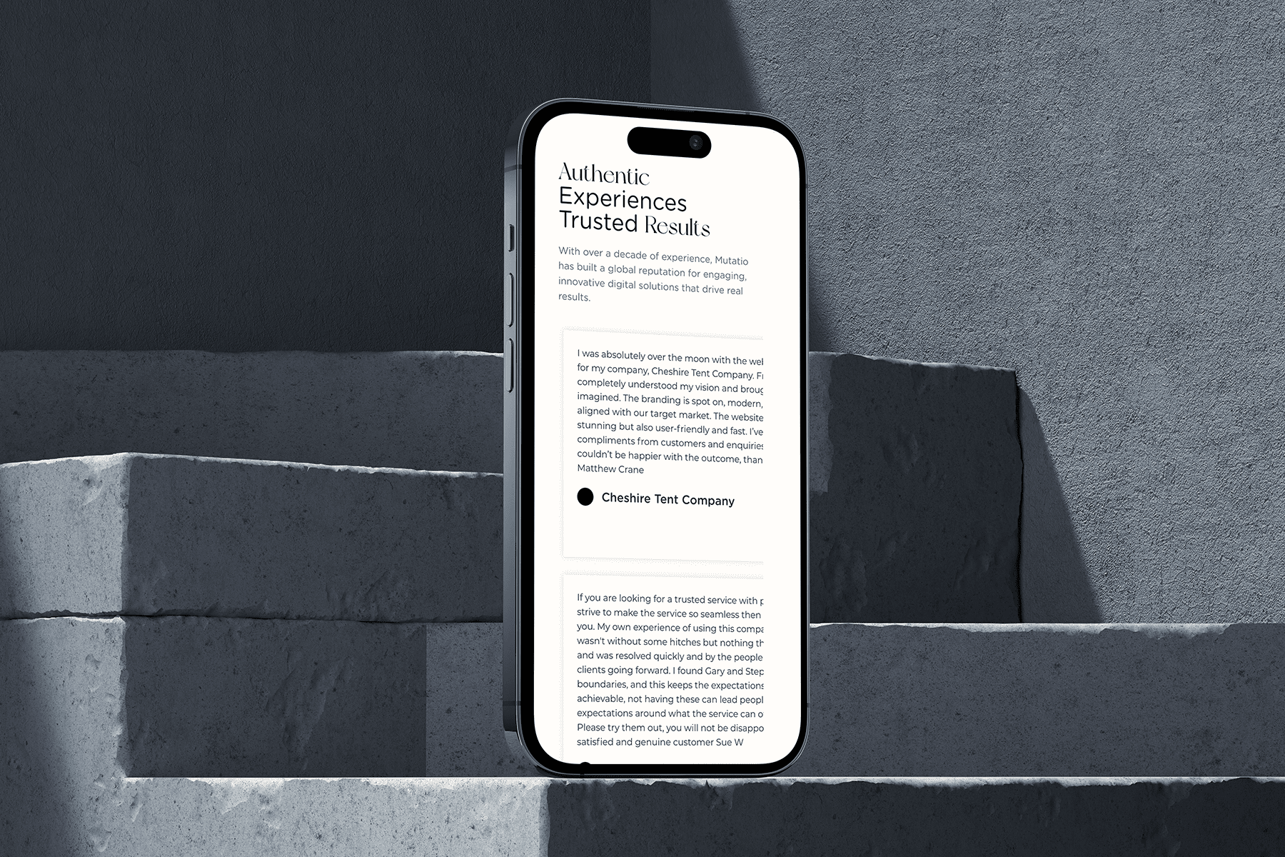
Designing a Modern Medical Visual Identity for Book A Drip

Developing a Cohesive and Reassuring Brand Identity for IV Drip Services

Overview:

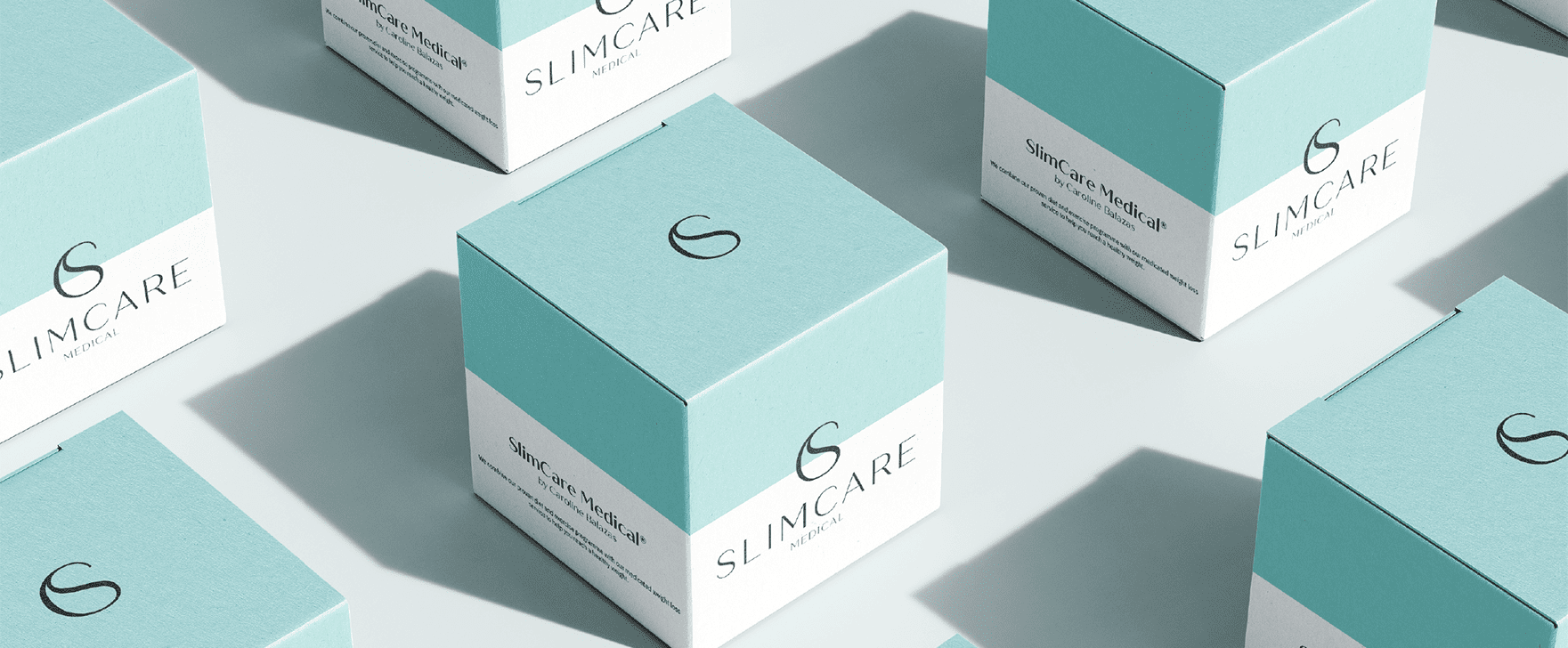
For Book A Drip, we developed a refined brand concept rooted in a modern medical aesthetic. Concept Two was designed to position the brand as credible, trustworthy, and clinically sound, while still feeling human and approachable. The outcome is a visual identity that confidently sits within the healthcare space without feeling cold or intimidating.

Objectives:
Our primary objective was to elevate Book A Drip’s brand presence to reflect professionalism, reliability, and expertise. We wanted the brand to immediately signal trust and medical credibility, reassuring users that they are engaging with a service that prioritises safety, care, and quality at every touchpoint.

Visually, the concept leans into clean layouts, structured composition, and restrained design choices. The sharp-edged radial icon introduces a sense of precision and continuity, while the overall design language remains uncluttered and intentional, reinforcing clarity and ease of use across digital and physical applications.

Consistency was key across the entire design for the brand. From the logo and typography to colour usage and imagery, every element works together to create a cohesive identity. The deep teal-green anchors the brand visually, while supporting tones add balance, warmth, and subtle energy without overpowering the clinical foundation.

The intent behind Concept Two was to strike a careful balance between medical authority and human reassurance. IV therapy can feel unfamiliar to some users, so the design needed to reduce apprehension, build confidence, and communicate expertise in a calm, composed way.

The brand identity is communicated through deliberate simplicity. Clean sans-serif typography ensures information is easy to digest, while the colour palette subtly guides emotional response in forms of trust, care, renewal, and vitality. Imagery and layouts further reinforce a sense of professionalism backed by science, not trends.

Ultimately, the representation of Book A Drip should reflect confidence, care, and clinical integrity. The brand is designed to communicate trust at first glance, reinforcing the idea that users are in safe, professional hands. Through its considered visual language, the identity reflects a service that is science-led, reliable, and compassionate. In the light of modern healthcare that feels reassuring, not intimidating.

Mood Board for Book a Drip: Fluid Corporate Branding

The mood board sets the visual direction for Concept Two by defining a modern medical tone that feels calm, credible, and reassuring. It brings together references from clinical environments, hydration, and wellness to establish a clear atmosphere and one that positions Book A Drip as a professional healthcare service rather than a lifestyle trend.

The colour palette showcased in the mood board balances medical professionalism with warmth and approachability. Deep teal and aqua tones form the foundation, reflecting trust, cleanliness, and hydration, while softer yellow and orange accents introduce optimism and a human touch. Subtle textures inspired by liquid, glass, and light reinforce the idea of fluidity, care, and renewal without overwhelming the design.

Typography within the mood board centres around clarity and reliability. Clean, modern sans-serif typefaces are used to ensure legibility across digital and print applications, supporting the clinical aesthetic while remaining approachable. The typographic choices reinforce a sense of structure and professionalism, helping the brand feel authoritative yet accessible.

Imagery plays a key role in grounding the brand in real-world care and science. The mood board features visuals associated with IV therapy, hydration, and medical environments, paired with clean, minimal compositions. This approach ensures the imagery supports trust and transparency, helping users feel informed, reassured, and confident in the service being offered.

Designers quote

Jessica Thornton

“For Book a Drip Concept 2, I created a brand identity that balances medical credibility with warmth and approachability. The sharp radial icon represents continuity and wellness, while the deep teal-green establishes trust and professionalism.”

Colour Scheme for Book a Drip: Fluid Corporate Branding

The colour scheme for Concept Two encapsulates a thoughtful balance between medical professionalism and human reassurance. Each tone was carefully selected to communicate trust, stability, and care. These are all essential qualities for a healthcare-focused brand like Book A Drip. The palette has been designed to feel calm, composed, and confident, avoiding anything overly sterile or intimidating. Instead, it creates a visual environment that feels reassuring and considered, helping users feel comfortable and confident when engaging with the brand.

The deep teal-green used throughout the brand acts as the central anchor of the identity. This colour conveys expertise, reliability, and medical credibility, instantly positioning Book A Drip within a professional and trusted healthcare space. Its depth provides a strong and grounding presence, while its refined tone ensures the brand feels modern and polished. This balance allows the colour to feel authoritative without becoming heavy or clinical.

Aqua tones are introduced as a secondary colour to reinforce associations with cleanliness, hydration, and renewal. This lighter, fresher shade brings a sense of clarity and openness to the palette, creating visual contrast and balance against the deeper tones. It helps communicate fluidity and wellness while softening the overall aesthetic, ensuring the brand feels approachable, calm, and easy to engage with across different touch points.

When used together, the colour scheme creates a cohesive brand identity that feels trustworthy, calm, and reassuring. The interplay between grounded medical tones and lighter, uplifting accents reflects a service that is both science-led and people-focused. This considered balance allows Book A Drip to present itself as professional and credible, while also emphasising care, accessibility, and a human-centred approach to healthcare.

Font Selection for Book a Drip: Fluid Corporate Branding

DM Sans is an effective choice for Book A Drip because it delivers exceptional clarity and readability across digital and print platforms. In a healthcare setting, where information must be easily understood, the font ensures messaging feels clear, confident, and accessible, supporting trust at every interaction.

The style of DM Sans strikes a careful balance between modernity and approachability. Its clean, contemporary form gives the brand a current and professional edge, while its soft, rounded characteristics prevent it from feeling overly clinical. This balance helps the brand feel credible without becoming intimidating.

Visually, DM Sans contributes to a calm, structured, and refined aesthetic. The simplicity of the letterforms supports a modern medical look, while the openness of the typeface adds warmth and ease. This creates a visual language that feels composed, reassuring, and human.

DM Sans works seamlessly for Book A Drip because it aligns perfectly with the brand’s overall identity. It reinforces professionalism and expertise while maintaining a welcoming tone, supporting the brand’s goal of making IV therapy feel safe, reliable, and approachable. Together with the colour palette and visual system, the typography helps position Book A Drip as a modern healthcare brand built on clarity, care, and trust.

Logo Design For Book a Drip: Fluid Corporate Branding

The logo for Book A Drip was designed with a clear focus on professionalism and medical credibility. Concept Two moves away from expressive or lifestyle-led visuals, instead embracing a refined, clinical approach that reflects the brand’s position within the healthcare and wellness space. The result is a logo that feels confident, composed, and purpose-driven.

At the centre of the logo is a sharp-edged radial symbol. This icon represents continuity, balance, and ongoing care, as well as core principles behind IV therapy and health optimisation. Its structured, geometric form reflects precision and reliability, reinforcing the brand’s medical foundation.

The radial symbol encapsulates longevity, wellness, and consistency. Its circular nature suggests sustained treatment and long-term health benefits, while the sharp edges introduce a sense of accuracy and expertise. Together, these elements communicate a service that is both methodical and patient-focused.

Overall, the logo highlights Book A Drip’s commitment to trust, professionalism, and care. It visually communicates expertise without feeling cold, supporting the brand’s modern medical aesthetic. Paired with the colour palette and typography, the logo helps position Book A Drip as a credible healthcare provider that values clarity, balance, and reliability.

Final Concept Board for Book a drip: Fluid Corporate Branding

The final concept board brings together all elements of Concept Two into a cohesive, modern medical brand identity. It reflects a carefully considered system where colour, typography, logo design, and layout work in harmony to present Book A Drip as a professional, trustworthy healthcare brand with a contemporary edge.

This concept is designed to resonate with individuals seeking reliable, clinically led IV therapy. It speaks to users who value expertise, safety, and professionalism, while also reassuring them through a calm and composed visual language that reduces uncertainty and builds confidence.

The typography choices enhance clarity, accessibility, and trust throughout the brand. DM Sans supports clean communication and ensures information feels approachable without sacrificing professionalism. Its modern structure reinforces the clinical aesthetic while maintaining a human, welcoming tone across all applications.

The logo plays a central role within the final concept board, acting as a strong visual anchor for the brand. Its refined, structured design complements the surrounding elements, ensuring consistency and recognisability across digital, print, and physical touch points.

The radial symbol encapsulates continuity, balance, and ongoing care as the core values of Book A Drip’s service offering. It reflects a long-term approach to wellness and health optimisation, reinforcing the idea of dependable, science-led treatment delivered with precision and care.

The final concept board also demonstrates how the brand translates seamlessly across different applications. From digital platforms to physical touchpoint, the consistent use of colour, typography, and iconography ensures the identity remains cohesive and recognisable. This visual consistency strengthens brand recall and reinforces Book A Drip’s professional presence at every stage of the user journey.

Challenges of Branding for Book a Drip: Fluid Corporate Branding

Branding within the healthcare and wellness space presents a unique challenge. It requires balancing medical credibility with approachability, ensuring the brand feels trustworthy without appearing cold or intimidating. For Book A Drip, the challenge was to communicate expertise, safety, and professionalism while still creating a visual identity that feels human, reassuring, and accessible to a wide audience.

Through a carefully considered colour palette, purposeful typography, and a refined logo design, Concept Two creates a cohesive brand that supports clarity, trust, and confidence. The colours establish emotional reassurance and credibility, the typography ensures information is communicated clearly and professionally, and the logo reinforces continuity, care, and expertise. Together, these elements work seamlessly to drive recognition, consistency, and trust across every brand touchpoint.

Conclusion

Concept Two maintains a cohesive visual system that supports clarity, professionalism, and confidence throughout the brand.

Ultimately, Concept Two positions Book A Drip as a modern medical brand built on professionalism, care, and reliability. The final identity reflects a service that is science-led yet approachable, ensuring users feel confident from first interaction through to treatment. This project highlights Mutatio’s ability to translate complex healthcare services into clear, confident, and future-focused brand experiences that resonate with both clients and their audiences.

Keep Reading

Building Brands with Substance in Chicago’s Most Demanding Market

Brand Strategy for New York: Clarity in the World’s Most Competitive Market

Building a Brand

Authentic Branding for Liverpool Brands Built on Character and Conviction