A Captivating Branding Concept for Capitalize Ltd

Introduction

Every single design element in a brand identity needs to resonate with the overarching values of the company, in the case of Capitalize Ltd these are trust, innovation, and financial growth. The proposed branding concept does this by employing that meaningful symbolism, modern typography and a refined colour palette to communicate the essence of the firm’s mission. From a logo that draws from pie charts to represent investment and prosperity to a mix of strong yet welcoming typefaces, everything affirms their status as a modern powerhouse in financial services. The strategic incorporation of these components contributes to a professional persona that resonates with both experienced investors and upstart companies.
Market Research

The branding concept market research undertaken on competitors in the financial services sector, incorporating a deep-dive of client pain points led the design team to an initial list of brand attributes (Credibility, Trust, Expert, Professional, Innovative). Examining pie chart symbolism confirmed the need to visually engage with money in a way that is transmitted in the logo as an investment, and a commensurate growth, which the brand embodies. With this in mind, we honed in on modern design tendencies that established the importance of clean, easy to read typography and an adaptable colour palette to satisfy tech-savvy, forward-thinking consumers. Fuelled by research, this approach made sure that each element of the branding strategy emerges with both the spirit of Capitalize Ltd and uniqueness in a crowded space.

Designers Quote

Strategic design starts with a purposeful palette. Creating a visually compelling harmony that speaks to professionalism and innovation in the finance industry. The design forms a dynamic narrative, reflecting the core values of reliability, progress, and precision that define financial success.

This logo design idea for Capitalize Ltd involves creating a symbol that connects to both finance and business along with the letter "C".

Logo Concept

The use of a pie chart shape allows us reflect back the financial focus of the firm, and the slice that is taken out represents investment; one individual (or company) owning part of that pie. This intelligent juxtaposition of symbolism connects the logo to Capitalize Ltd’s fundamental message: opening the door to investment and encouraging financial prosperity.

Instantly associating with financial services, the pie chart is also becoming a symbol for data, progress and ownership, while the “C” is reminiscent of brand name recognition. It’s an excellent example of how the interplay among these graphic elements produces a logo that is both memorable and professional and suggests financial acumen and accessibility. The logo simplifies in a visual way the shared investment proposed by Capitalize Ltd.

Typography: Agrandir & Poppins

Typography is an important aspect producing a brand’s voice. Agrandir is the perfect header font for Capitalize Ltd; it straddles modernism and professionalism. Its clean lines and geometric quirks give a creative edge, a signature distinguishing the company from more staid financial institutions. This modernist font embodies Capitalize Ltd’s progressive mindset, begging clients not only for their trust, but also for their inquiry. Agrandir’s audaciousness means important messages stand out, yet doesn’t dominate the design, providing a clean, clear interface on all platforms.

For the paragraph style, we chose Poppins, which adds a bit of class and readability. This geometric sans-serif font aids legibility, a key aspect of communicating complex financial data. Poppins’ playful yet minimalist design helps this text to stay approachable and user-friendly across a variety of devices, making sure you appeal to your tech-savvy audience. Agrandir and Poppins together provide a pleasing and sophisticated sensory balance, and are used in such a way that information remains digestible while retaining a fresh and modern feel.

Colour Palette Concept

The colour palette for Capitalize Ltd is pulled from four colours, each colour fulfilling a separate purpose when needing to reinforce the brand:

#132dd1: A deep, vibrant blue that conveys authority, trust and professionalism — the important elements of any financial firm. This shade can work well as a leading brand colour, inspiring confidence in future investors and clients.

#e45a5a: This colourful red sparks energy and warmth to the brand. It highlights the design’s most important features, setting up bold visual contrasts, and inviting the viewer to engage emotionally. The bright but friendly tone works with the more neutral parts of the palette.

#692f5e: A deep, dark rich purple with the hint of red in the base This luxurious hue adds a layer of creativity and depth amid the eye-popping red and blue colors. It lends a sleek quality, forward-thinking with an air of finesse perfect for financial services looking to project sleek refinement.

#f3f3f3: A soft, neutral light grey for backgrounds or subtle elements in designs. Its understated quality means that other, more dominant colours shine, while also providing a clean, modern backdrop. It balances all the bright colours and makes the overall design polished and professional.

This harmonious colour palette evokes professionalism whilst providing spirit and sophistication, reflecting the essence of Capitalize Ltd’s core values of innovation, trust, and growth.

The Brand as a Whole

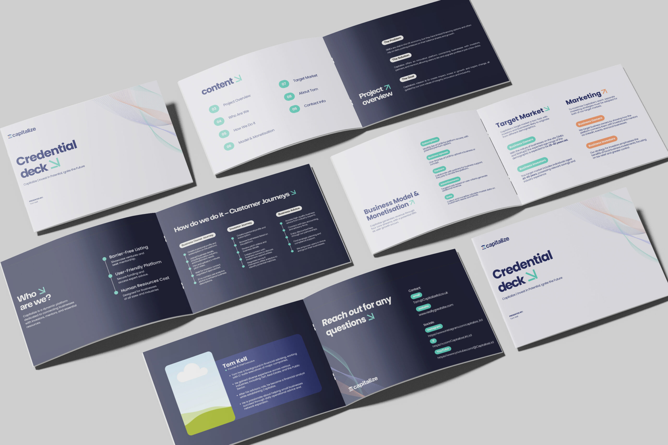
The overall design conveys professionalism and trust, but also reflects the company’s focus on innovation and accessibility. By employing clean and cohesive elements, these assets convey a sense of modernism and accessibility that presents the brand as approachable to a diverse spectrum of niches within the financial services industry. The design is succinct, both in terms of messaging and functionality, making client and investor engagement easier. With this integration of visual elements and purpose-driven design, Capitalize Ltd showcases its commitment to connections, growth, and positive relationships within a competitive landscape.

Capitalize Ltd’s branding concept stands as a testament to the power of thoughtful design in the financial sector.

From the logo’s pie chart-inspired symbolism to the meticulous selection of typography and colour, each element has been crafted to convey trust, innovation, and growth. The pie chart, with its subtle yet impactful integration of the letter “C,” reflects the company’s dedication to shared success and collaboration. This foundation ensures that the branding resonates deeply with both seasoned investors and emerging clients looking for a forward-thinking financial partner.

To Conclude

Agrandir’s modern appeal draws attention to key messaging, while Poppins provides clarity and accessibility.

The strategic use of Agrandir and Poppins typographies further enhances the brand’s identity by striking a balance between creativity and professionalism. Together, they make complex financial concepts more approachable, demonstrating Capitalize Ltd’s commitment to transparency and user-centric design. The chosen typefaces also offer versatility, supporting the brand’s adaptability in both digital and print environments.

The vibrant and balanced colour palette unites the branding, encapsulating professionalism, energy, and sophistication. Deep blue builds trust, while red, purple, and grey add layers of warmth, creativity, and modernity. These design choices create a visual language that is as inviting as it is authoritative. Capitalize Ltd’s branding not only sets a new standard in the financial sector but also ensures the company remains distinctive and memorable, positioning itself as a leader in innovation and collaboration within the competitive landscape of financial services.

Keep Reading

Capitalize Ltd Market Research by Mutatio – Take Your Business to New Heights

Bold & Bright Identity for a New Concept by Mutatio for Malka Livingstone

The Green Peace Branding Concept by Mutatio Creative Ltd