The Upper Deck Studio – Fluid Corporate Branding

The Upper Deck Studio: Fluid Corporate Branding – Concept 1

Overview

This project centered on redesigning The Upper Deck Studio’s website, transforming an outdated platform into a vibrant, modern, and performance-driven digital presence. After carefully discussing the client’s needs and aspirations for improvement, we envisioned a site that not only refreshed the aesthetic but also enhanced usability, engagement, and long-term adaptability.

The new design respects the essence of the original site while introducing a sleek, contemporary visual language. By weaving in bold colour choices, unique script fonts, and engaging stylistic elements, the website captures attention immediately and provides a memorable brand experience. The balance of modernity and colour ensures the brand identity remains approachable and energetic while reflecting The Upper Deck Studio’s evolving creative vision.


Objectives

The redesign had three key objectives:

  1. Modernisation with Retained Personality
    To upgrade the site into a cleaner, more polished digital platform that performs optimally across devices, while preserving the colourful, lively personality that defines the studio’s brand.

  2. Engaging and Distinctive Visual Identity
    To integrate bold, bright colours and unique type treatments that distinguish the brand. These carefully selected design elements serve to draw attention, convey creativity, and align with the studio’s innovative character.

  3. Strategic Functionality and Performance
    Beyond visual appeal, the new site is designed to streamline navigation, encourage engagement, and support ongoing performance. Every design choice was informed by a need for both aesthetic resonance and practical effectiveness.
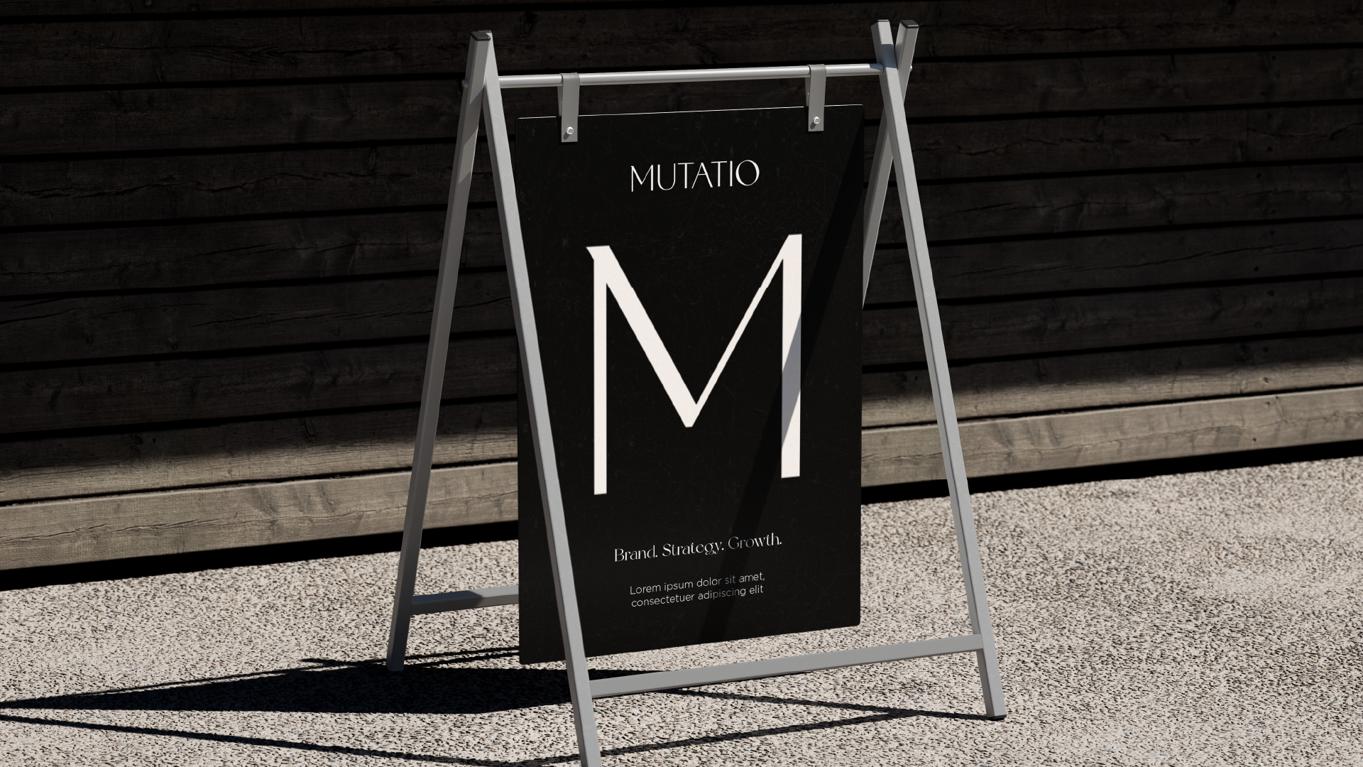
Mood Board for The Upper Deck Studio Fluid Corporate Branding

Colour Palette:
Bright and energetic hues dominate, reflecting the studio’s creative essence while ensuring visual vibrancy. These colours inject personality while maintaining balance, perfectly embodying Fluid Corporate Branding by combining excitement with coherence.

Typography:
The use of script fonts provides a personal, artistic touch, creating contrast with clean, modern typefaces to balance approachability with professionalism. This thoughtful pairing is essential in achieving Fluid Corporate Branding, ensuring both expression and legibility.

Imagery & Layouts:
Dynamic layouts paired with colourful accents deliver a sense of fun, movement, and creativity, reinforcing Fluid Corporate Branding that adapts across touchpoints while staying true to the core identity.

Together, these elements reinforce a cohesive identity that feels both modern and unique, a hallmark of successful Fluid Corporate Branding.

Designer’s Quote Fluid Corporate Branding

“I wanted the redesign to honour the colourful energy that makes The Upper Deck Studio distinctive while elevating its digital presence with a modern, user-friendly structure. The bold typography and vibrant palette are designed to immediately capture attention while supporting a brand that feels creative, approachable, and alive.”

Colour Scheme for The Upper Deck Studio Fluid Corporate Branding

The colour palette combines bright, bold hues with a refined structure, ensuring vibrancy without compromising usability — a balance essential to Fluid Corporate Branding.

Primary Shades:
Bright, energetic reds inject vitality and keep the site visually engaging while supporting the consistency required in Fluid Corporate Branding.

Accent Colours:
Secondary shades provide balance, creating harmony across pages. The addition of a light pink accent — reflective of its female-centric Pilates class — further reinforces Fluid Corporate Branding that is both targeted and versatile.

Overall Effect:
A palette that communicates fun and creativity but still offers a polished, professional finish — in perfect alignment with Fluid Corporate Branding principles.

Font Selection for The Upper Deck Studio

Typography choices reflect a balance of artistry and modern clarity, two pillars of effective Fluid Corporate Branding:

  • Unique Script Fonts: Introduce flair and individuality, adding a hand-crafted quality that aligns with expressive Fluid Corporate Branding.

  • Clean Modern Fonts: Ensure legibility and balance, which are necessary for any brand seeking to maintain Fluid Corporate Branding across digital platforms.

This pairing ensures the site is visually distinctive without sacrificing readability — a win for Fluid Corporate Branding.

Logo & Visual Integration

While the project primarily focused on the website redesign, visual treatments were extended to support the brand holistically. Fonts, colours, and design motifs were curated to maintain Fluid Corporate Branding, ensuring adaptability across future assets.

The visual system created serves as a foundation for Fluid Corporate Branding — a brand identity that shifts and adapts while remaining recognisable.

Final Concept Board for The Upper Deck Studio

The final result is a cohesive redesign that successfully marries bold creativity with functional clarity. The colourful, script-driven aesthetic energises the site, while modern layouts and performance-driven improvements future-proof the platform — all while maintaining strong Fluid Corporate Branding.

This identity not only positions The Upper Deck Studio as a vibrant creative hub but also exemplifies how Fluid Corporate Branding can support long-term brand growth and engagement.

Challenges

One of the main challenges of this redesign was striking the right balance between modernisation and preservation. The client wanted the site to feel fresh and high-performing without losing the colourful personality that defined the original brand. Achieving this required a strong grasp of Fluid Corporate Branding: using adaptable design principles that support change without disrupting core identity.

Additionally, ensuring that bold elements didn’t overwhelm the user experience demanded precision — a design strategy grounded in Fluid Corporate Branding. Ultimately, these challenges were resolved by blending bold creativity with structured, user-friendly functionality, producing a site that stands as a testament to effective Fluid Corporate Branding.

Conclusion

How Bold Colour, Unique Typography, and Modern Website Design Reimagined The Upper Deck Studio’s Digital Presence

The redesigned website embodies the studio’s lively character while offering a cleaner, more modern user experience. By combining strong visual identity elements—bright colours, engaging script fonts, and balanced layouts—the site delivers impact and memorability. The project demonstrates how strategic design can transform an existing brand presence into a cohesive, dynamic, and performance-ready digital platform that captures both the heart and the eye.

Keep Reading

A Prize Everytime Concept 3

a prize everytime

A Prize Everytime Concept 2

a prize everytime

A Prize Everytime Concept 1