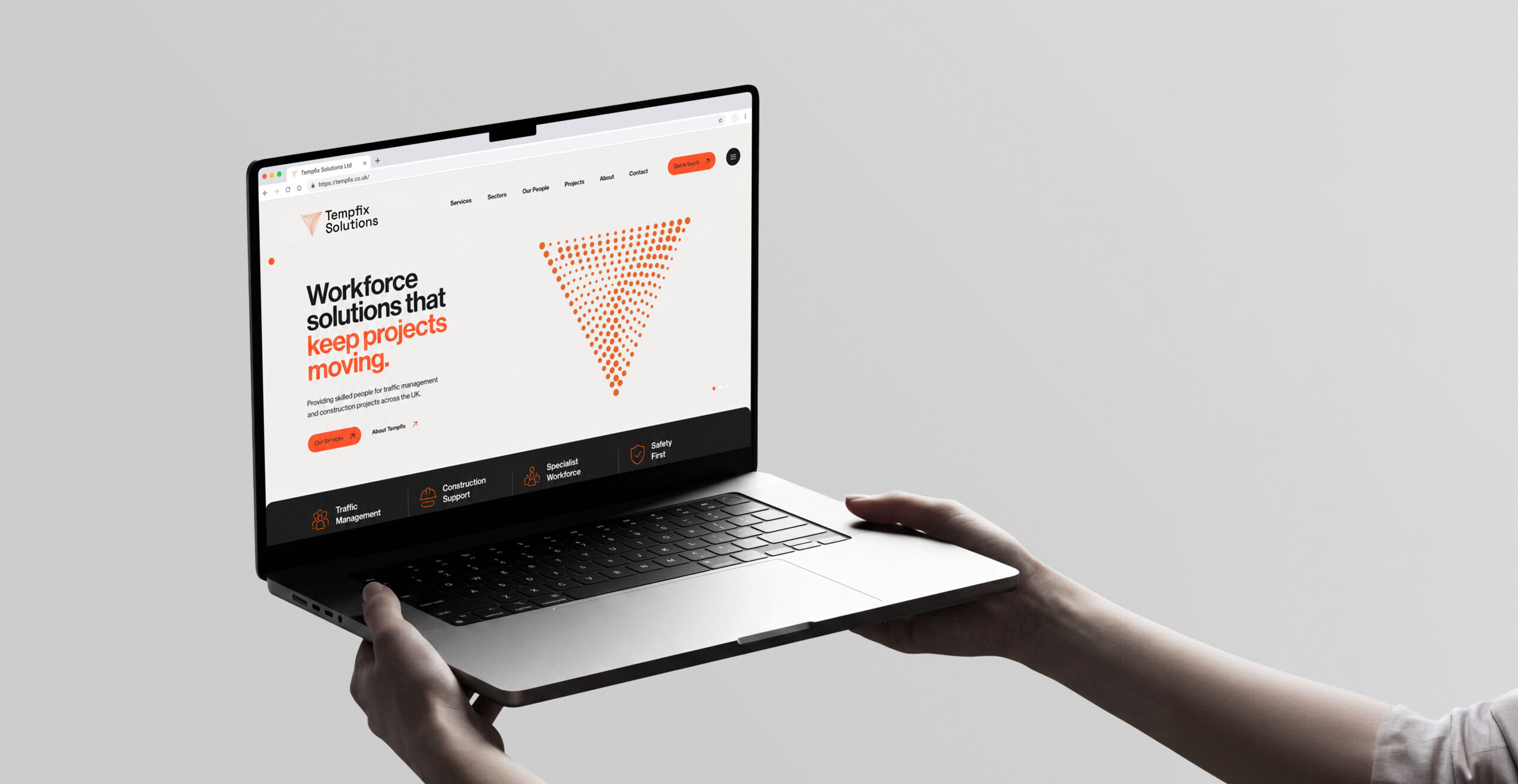
Connected Workforce Branding for Tempfix Solutions Ltd: Concept 2

Concept 2: A Connected and Progressive Identity for Tempfix Solutions Ltd

Project Scope: A Modern and Connected Brand Identity for Tempfix Solutions Ltd

Objective

Concept 2 explores a more connected, structured and digitally focused identity for Tempfix Solutions Ltd. The direction positions the company as a modern workforce partner that brings people, projects and infrastructure together through clear communication and dependable service.

The objective was to create Connected Workforce Branding that feels intelligent, forward-thinking and highly adaptable. Compared with the warmer, more industrial direction of Concept 1, this concept uses deep blue, teal and green tones to create a calmer and more technology-led impression.

The visual identity is designed around the idea of movement and connection. Flowing line graphics, a compact monogram and confident typography work together to communicate coordination, continuity and progress. The result is a professional brand system that reflects Tempfix’s ability to keep projects moving while building strong and reliable teams.

The core messages, “Building strong teams” and “The right people. Right on time.”, reinforce the company’s promise to deliver dependable workforce support exactly when clients need it.

Target Audience

Tempfix Solutions Ltd works with organisations that depend on reliable staffing, traffic management support and coordinated project delivery.

The target audience includes construction companies, infrastructure contractors, traffic management providers, procurement teams, project managers and businesses operating within complex or time-sensitive environments.

These audiences need a partner that understands the importance of safety, compliance, availability and workforce quality. They also expect communication to be clear, responsive and professional at every stage of the relationship.

The Connected Workforce Branding direction therefore needed to express:

  • Reliability and operational confidence
  • Strong workforce coordination
  • Safety-led service delivery
  • Modern systems and processes
  • Long-term partnership
  • Progress and project momentum

The identity is also designed to appeal to prospective employees and contractors by presenting Tempfix as an organised, supportive and forward-thinking employer.

Brand Identity

The brand identity is built around three core principles: connection, strength and progress.

Connection

The flowing line system represents people, services and projects coming together. It reflects Tempfix’s role in connecting skilled workers with the organisations and environments that need them.

Strength

The identity uses bold typography, structured layouts and a confident colour palette to communicate stability and professionalism. The message “Building strong teams” reinforces Tempfix’s focus on dependable people and lasting working relationships.

Progress

Curved graphic lines and directional forms create a continuous sense of movement. These elements suggest roads, routes, infrastructure and coordinated pathways, helping the brand feel active without appearing rushed or chaotic.

Together, these principles form a Connected Workforce Branding system that feels contemporary, dependable and aligned with the needs of modern project-based industries.

Deliverables

The concept presents a complete Connected Workforce Branding direction designed for use across digital, environmental and corporate applications.

The proposed deliverables include:

  • Primary and secondary logo variations
  • Standalone monogram
  • Colour palette and typography system
  • Brand guidelines
  • Website design direction
  • Social media templates
  • Recruitment campaign graphics
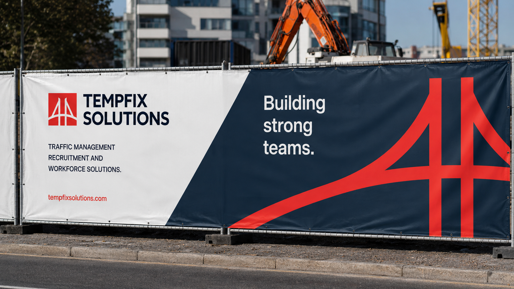
  • Construction hoarding
  • External signage
  • Branded workwear and PPE
  • Business cards and stationery
  • Presentation folders and notebooks
  • Branded merchandise
  • Mobile app icon and digital assets

The identity has been designed as a connected system rather than a series of separate applications. This ensures Tempfix can maintain a consistent and recognisable presence across every client, employee and public-facing touchpoint.

Tone and Messaging

The tone of voice is confident, supportive and solution-focused.

Tempfix operates in environments where clear communication and dependable delivery are essential. The messaging therefore remains direct and practical while also placing greater emphasis on teamwork, partnership and progress.

Key messaging includes:

  • Building strong teams.
  • The right people. Right on time.
  • Workforce solutions that keep projects moving.
  • Great people. Safety focused. Stronger teams.
  • Intelligent traffic management for a moving world.

These statements help the Connected Workforce Branding communicate both the practical and human sides of the Tempfix offer.

The overall voice is professional without feeling distant. It positions Tempfix as a capable partner that understands operational pressures while remaining approachable and easy to work with.
Mood Board for Tempfix Solutions: A Connected and Progressive Direction

The mood board explores a modern and coordinated visual direction inspired by transport networks, infrastructure, connection and continuous movement.

This Connected Workforce Branding concept uses a deep blue foundation with layered teal and green accents. The colour palette creates a strong sense of professionalism while introducing enough energy to keep the identity active and contemporary.

The visual system is more streamlined and technology-led than Concept 1. It uses curved line graphics, simplified layouts and a distinctive monogram to create a brand that feels organised, efficient and future-focused.

Colours

The palette combines deep navy, petrol blue, bright teal and a pale neutral background.

The darker blue tones communicate trust, stability and professionalism. Teal and green introduce energy, safety and progress, while the lighter neutral tone provides clarity and balance across corporate and digital applications.

Typography

Typography is clean, modern and highly legible.

A simple sans-serif typeface creates a strong and accessible communication system. Medium weights are used for headlines and key statements, while regular weights support body copy and detailed information.

This approach ensures the brand remains clear across websites, signage, social media and printed materials.

Imagery

Imagery focuses on roads, transport systems, infrastructure, construction environments and active project locations.

Aerial road photography and large-scale project visuals reinforce the themes of movement, planning and connectivity. The photography feels purposeful and relevant to Tempfix’s sectors, avoiding generic recruitment imagery.

Textures and Patterns

The defining graphic device is a set of parallel curved lines that flow across layouts.

These lines reference roads, routes and coordinated movement. Their consistent spacing creates structure, while their curves introduce flexibility and momentum.

The pattern can be cropped, enlarged or repeated, allowing it to work across stationery, digital screens, construction hoarding and office environments.

Logo Inspiration

The logo mark is formed from a stylised T symbol built from structured horizontal and vertical forms.

Its shape can be interpreted as a road junction, support structure or connected pathway. This gives the identity a strong relationship with traffic management, infrastructure and workforce coordination without relying on obvious or overused industry symbols.

The result is a compact, recognisable mark that can perform effectively as a logo, social media icon, app icon and branded graphic device.

Designers Quote

Graphic Designer – Jessica Thornton

Colour Scheme for Tempfix Solutions

The colour palette has been developed to support a calm, confident and modern Connected Workforce Branding identity.

Deep Navy — Core Brand Colour

Deep navy forms the primary foundation of the concept.

It communicates trust, stability and professionalism, making it particularly effective for client-facing materials, digital interfaces, signage and large-format applications.

Deep navy: #005374

Petrol Blue — Supporting Brand Colour

Petrol blue adds depth and variation to the palette.

It works well across secondary backgrounds, environmental graphics and supporting content, helping the identity remain visually rich without losing consistency.

Petrol blue: #028090

Bright Teal — Primary Accent

Bright teal is the main accent colour within the system.

It introduces freshness, energy and movement while creating strong visibility across digital and physical applications. It is used for key words, calls to action, icons and graphic line work.

Bright teal: #09C298

Pale Neutral — Clarity and Balance

The pale neutral shade provides space and contrast.

It supports readability and helps balance the darker colours, particularly across stationery, presentation materials and interface elements.

Pale neutral: #EAF4F1

Together, these colours create a distinctive palette that feels trustworthy, contemporary and relevant to Tempfix’s operational environment.

Font Selection for Tempfix Solutions

Typography has been selected to create a clear, modern and approachable brand voice.

The concept uses a contemporary sans-serif family with medium weights for headlines and regular weights for body copy.

Medium — Headline Weight

Medium weights are used for headlines, campaign statements and key messages.

This creates authority without making the identity feel too heavy. Phrases such as “Building strong teams” and “Workforce solutions that keep projects moving” remain bold, clear and accessible.

Regular — Body Weight

Regular weights are used for supporting copy, service descriptions and digital content.

The clean letterforms provide excellent readability across screens and printed materials, helping the identity remain practical as well as visually distinctive.

The overall typographic system supports quick communication while giving the brand a professional and unified appearance. Again focusing on that Connected Workforce Branding. 

Logo Design for Tempfix Solutions

The Concept 2 logo is based around a compact monogram that combines the letter T with forms inspired by roads, junctions and structural support.

The upper bar creates a strong horizontal foundation, while the central split introduces the idea of different routes or people coming together. This visual connection reinforces Tempfix’s role in coordinating workers, services and projects.

The logo is simple enough to remain recognisable at small sizes while retaining impact across larger applications.

It can be used in several configurations:

  • Primary logo with symbol and wordmark
  • Horizontal logo
  • Stacked logo
  • Standalone monogram
  • Reversed white version
  • Teal gradient version
  • Single-colour version
  • App and social media icon

The monogram gives the Connected Workforce Branding a highly ownable symbol that can be repeated across digital interfaces, signage, uniforms and promotional materials.

Final Concept Board for Tempfix Solutions

The final concept board brings together all elements of the Connected Workforce Branding direction.

It demonstrates how the logo, colour palette, typography, website, workwear, environmental graphics and digital applications operate as one unified system.

Logo System

The stylised monogram provides a compact and recognisable symbol inspired by connection, routes and structural support.

Colour Palette

Deep navy, petrol blue, bright teal and pale neutral create a confident and balanced colour system.

Typography

The clean sans-serif type family supports strong headlines and highly readable body content.

Digital Applications

The website and mobile icon demonstrate how the identity can function clearly across modern digital platforms.

Environmental Branding

Construction hoarding and office signage show how the curved line system can build recognition across large physical spaces.

Workwear and Merchandise

High-visibility garments, notebooks, folders and water bottles demonstrate the flexibility of the identity across practical applications.

Together, these components create a connected brand system that feels professional and ready to support Tempfix’s future growth.

Challenges of Branding Tempfix Solutions

One of the main challenges was creating an identity that felt modern and technology-led without making Tempfix appear impersonal.

The company’s services depend on people, trust and long-term working relationships, so the concept needed to balance structured digital design with approachable language and human-centred messaging.

Another challenge was representing several service areas through one coherent identity. Traffic management, recruitment and workforce support must feel connected without losing their individual importance.

The curved line system helps resolve this by acting as a shared visual language that can represent routes, people, services and project movement.

Differentiation was also important. Many companies within the sector use predictable construction symbols, high-visibility colours and generic workforce imagery. The monogram and blue-teal palette give this Connected Workforce Branding concept a more ownable and contemporary appearance.

The identity also needed to remain effective across very different applications, from app icons and social media posts to construction hoarding and office signage. The simplified logo, focused palette and adaptable graphic pattern provide the consistency required across these formats.

Finally, the Connected Workforce Branding needed to communicate progress and responsiveness without creating visual noise. The controlled use of curved lines and strong spacing allows the brand to feel active while retaining clarity and professionalism.

Conclusion

Concept 2 positions Tempfix Solutions Ltd as a connected, intelligent and dependable workforce partner.

The identity communicates the company’s ability to coordinate people, projects and services through a clear and structured visual system. Its deep blue and teal palette establishes trust, while the flowing line graphics introduce movement, connection and progress.

Through its distinctive monogram, confident typography and adaptable visual language, the Connected Workforce Branding concept creates a strong platform for websites, recruitment campaigns, workwear, signage and project environments.

At the centre of the direction is a clear promise:

Building strong teams.

This message captures Tempfix’s focus on dependable people, safe delivery and lasting partnerships.

Overall, this Connected Workforce Branding direction gives Tempfix Solutions Ltd a modern and flexible identity that can evolve alongside the business. By combining intelligent design with clear messaging, the concept strengthens brand recognition, supports future growth and communicates Tempfix’s commitment to delivering the right people, in the right place and at the right time.

This concept also provides Tempfix Solutions Ltd with a flexible foundation for future campaigns, new services and continued business growth. By combining a clear visual structure with meaningful ideas of connection and movement, the Connected Workforce Branding can remain consistent across every touchpoint while continuing to reflect the company’s focus on strong teams, reliable delivery and long-term client partnerships.

Keep Reading

Infrastructure Workforce Branding

Infrastructure Workforce Branding for Tempfix Solutions Ltd: Bridge & Build

Workforce Solutions Branding

Workforce Solutions Branding for Tempfix Solutions Ltd: Concept 1

Sports Wear Branding

Concept 2: Performance-Driven Sports Wear Branding for Sports Trend