Echo was conceived as a digital platform designed to amplify youth voice, encourage participation, and create meaningful engagement between young people and their communities. At its core, the platform needed to feel accessible, empowering, and intuitive. Removing barriers to expression while providing structured pathways for feedback, collaboration, and discovery. This foundation is strengthened through an Engaging website Design that prioritises clarity and usability. The design direction therefore centred on clarity, inclusivity, and energy, ensuring that users of varying digital confidence levels could navigate and contribute with ease, supported by an Engaging website Design approach.
From a functional standpoint, the platform integrates several key components: interactive forms for feedback submission (“Let Us Know”), community-driven content such as events and blogs, and resource hubs containing downloadable materials like youth charters and guides. Each page was carefully structured to reduce friction, using modular card-based layouts, clearly defined sections, and progressive disclosure of information. This ensures that users are not overwhelmed, but instead guided through the experience in a logical and supportive way. Hallmarks of an Engaging website Design. Visually, the design leans into a soft, gradient-led interface paired with rounded UI components and approachable iconography, reinforcing an Engaging website Design that feels both modern and accessible.
The gradients introduce vibrancy and motion, subtly reinforcing the idea of change, growth, and evolving voices. The key themes underpinning the Echo initiative. This visual energy plays a crucial role in delivering an Engaging website Design that resonates with younger audiences.
The mobile-first approach was fundamental to the concept. Given the target audience, the platform was designed to perform seamlessly across devices, with particular emphasis on mobile usability. Interfaces such as event listings, submission forms, and content feeds were optimised for thumb-friendly interaction, ensuring that engagement could happen anytime, anywhere. This commitment ensures the delivery of an Engaging website Design across all devices, while responsive layouts maintain consistency and adaptability. Further enhancing the Engaging website Design experience.
Ultimately, the design concept for Echo is rooted in empowerment through simplicity. Every interaction, visual choice, and structural decision was made to support user confidence, encourage participation, and make the act of sharing one’s voice feel both safe and valued, core principles of an Engaging website Design.
The visual identity for Echo is built around a vibrant yet soft colour system, primarily using gradients that blend warm and cool tones. These gradients serve both an aesthetic and symbolic purpose, representing diversity, inclusivity, and the spectrum of voices within the community. Colours such as soft blues, warm oranges, and fresh greens were chosen to evoke trust, energy, and growth respectively, contributing to an Engaging website Design that feels optimistic and inviting.
The art direction combines clean UI elements with playful, illustrative touches. Hand-drawn style icons and subtle line illustrations introduce a human element, reinforcing the idea that the platform is built around people and their stories. This approach enhances the emotional connection within the Engaging website Design, particularly in sections like “Voice,” where icons visually represent different forms of expression.
Photography and imagery were used selectively to ground the platform in real-world context. Event imagery, such as football tournaments or community gatherings, adds authenticity and relatability, helping users see themselves reflected in the platform. These visuals support an Engaging website Design by balancing realism with clarity and maintaining a consistent visual rhythm across pages.
Typography plays a supporting but important role, favouring clean, legible typefaces that enhance readability across devices. Hierarchy is established through scale and spacing rather than overly decorative fonts, ensuring that content remains the focal point. Another key aspect of an Engaging website Design.

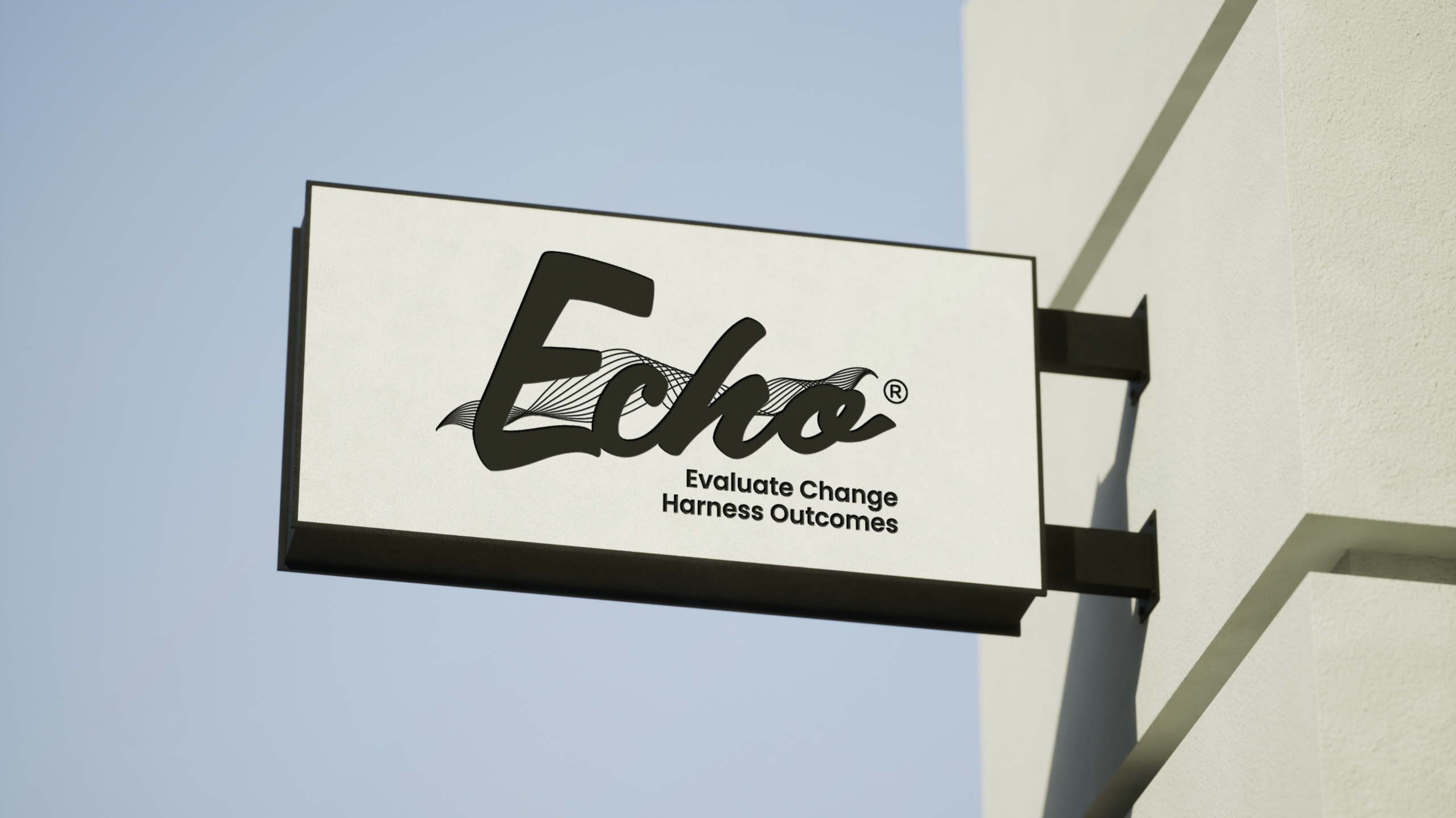
Echo is a platform developed as part of the Inicio Group, focused on evaluating change, harnessing outcomes, and amplifying the voices of young people within communities. The organisation works to bridge the gap between youth and decision-makers by providing tools and spaces for feedback, collaboration, and engagement, all delivered through an Engaging website Design that supports interaction.
The customer experience was designed with accessibility and engagement as the primary focus. From the moment users land on the platform, they are presented with clear entry points into key actions. Whether that’s sharing feedback, exploring resources, or discovering upcoming events. The navigation is intentionally simple, reducing cognitive load and aligning with the principles of an Engaging website Design.
A core benefit of the website is its ability to empower users to contribute their voice in a structured yet flexible way. Features like the “Let Us Know” form break down the process of giving feedback into manageable steps, guiding users through questions about their experiences, ideas, and suggestions. This structured approach reflects an Engaging website Design that balances guidance with freedom of expression.
The platform also prioritises content discovery. Sections such as resources and blogs are presented in a card-based format, making it easy to browse and engage with materials. Each piece of content is clearly categorised and visually distinct, reinforcing the efficiency of an Engaging website Design.
Events play a significant role in the experience, providing opportunities for offline engagement. Event pages are designed to be informative yet visually engaging, with clear details such as date, time, and location, alongside supporting imagery. Further strengthening the Engaging website Design strategy.
Overall, the approach taken was to design an experience that feels supportive rather than directive. By combining clarity, visual appeal, and thoughtful interaction design, the platform encourages users to explore, engage, and return demonstrating the lasting impact of an Engaging website Design.
The Echo platform represents a carefully considered balance between functionality, accessibility, and visual identity. Through a clean, modular design system and a vibrant yet approachable aesthetic, the platform successfully creates an environment where users feel encouraged to engage and share their perspectives. Brought together through an Engaging website Design.
For the client, the platform delivers a scalable and adaptable solution that can evolve alongside their initiatives. The modular structure allows for new content, features, and campaigns to be integrated, ensuring longevity and relevance over time, all supported by an Engaging website Design framework.
The visual identity not only strengthens brand recognition but also reinforces the platform’s purpose. By combining gradients, soft UI elements, and human-centred illustrations, the design communicates openness, inclusivity, and energy key values expressed through an Engaging website Design.
From a user perspective, the platform offers a seamless and empowering experience. The intuitive navigation, clear content structure, and engaging visuals work together to reduce barriers and encourage participation, ultimately defining the success of an Engaging website Design.
In conclusion, the Echo project showcases how strategic design, combined with a strong understanding of user needs, can deliver both aesthetic and functional success. It stands as a testament to the power of design in shaping engagement, driving participation, and ultimately creating positive change through an Engaging website Design.
“The Echo project was an exciting opportunity to design both an app and a website from the ground up. By collaborating closely with the client, we were able to craft a digital experience that feels unique, thoughtful, and true to their brand.”
Molly Bailey
Graphic designer