Diamond Dais Blog

Diamond Dais Web Design Blog: Designing a Digital Brand That Breathes

Crafting a Seamless, Story-Driven eCommerce Experience

Overview

The Diamond Dais Web Design Blog set out to create more than just an online shop — they envisioned a digital destination that felt like a conversation. A space that welcomed, resonated, and reflected their deep commitment to craft and emotional connection.

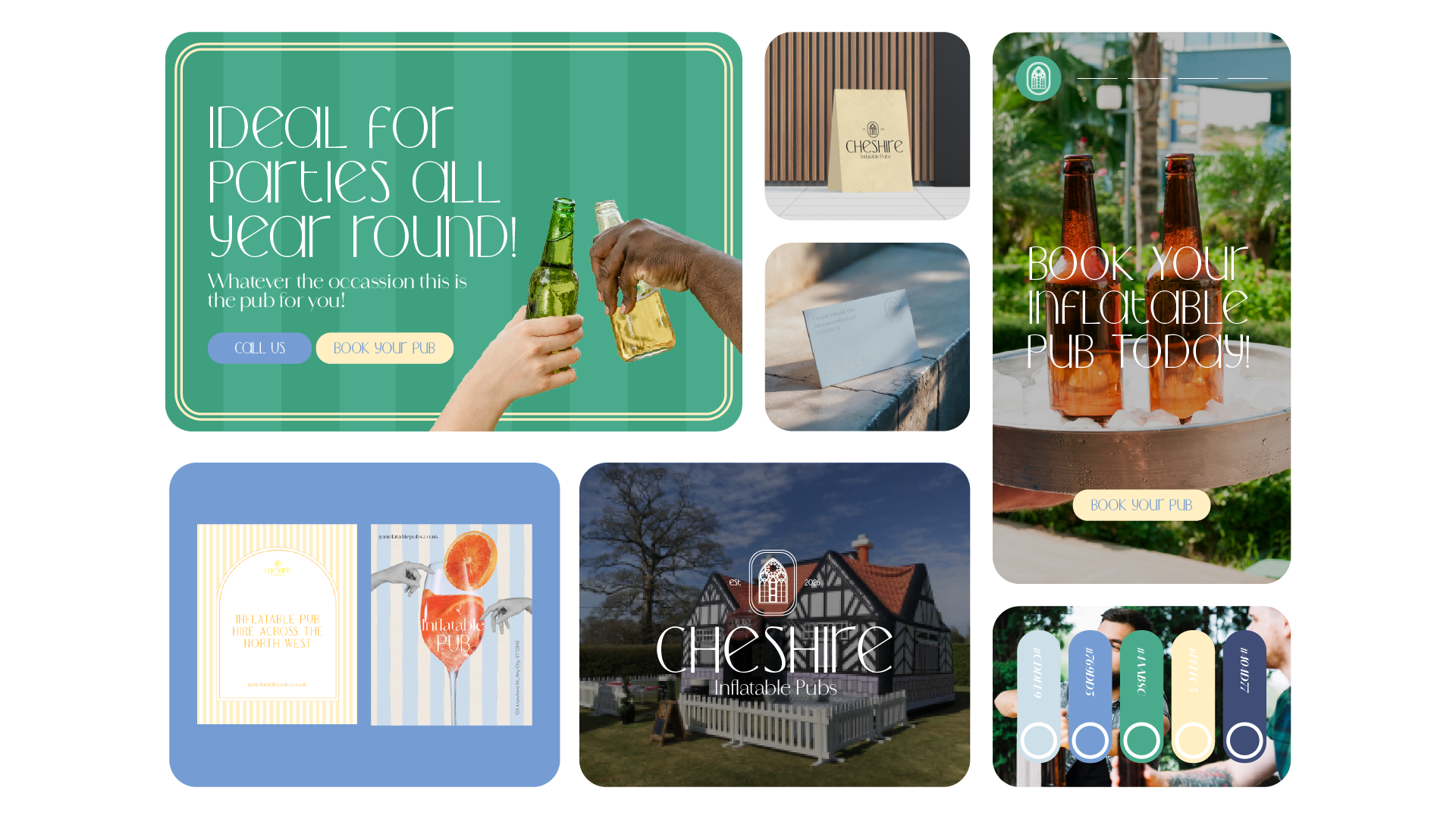
Rooted in timeless aesthetics and thoughtful simplicity, the project centered around designing a digitally fluid brand experience — one that balanced visual beauty with commercial clarity. The Diamond Dias Web Design Blog prioritized every detail, from colour and typography to product storytelling and user flow, ensuring that each decision built trust, evoked emotion, and moved customers from curiosity to connection.


Project Goals

The design objectives were clear from the outset on the Diamond Dais Web Design Blog:

  • Establish warmth and clarity through minimalist design

  • Create emotional resonance without compromising usability

  • Translate artisanal detail into scalable, high-functioning UI systems

But this wasn’t just about design; it was about digital storytelling. The Diamond Dais Web Design Blog aimed to reflect their ethos — delicate yet grounded, elegant yet honest. The experience had to feel handcrafted, even when rendered at scale across browsers and devices.

Consistency across platforms — from mobile layouts to packaging to social touchpoints — was also a core goal. The Diamond Dais Web Design Blog ensured that the site carried the same gentle authority wherever the brand lived. That harmony wasn’t just aesthetic; it was strategic, reinforcing the brand’s voice and values at every user interaction.

Moodboard: A Soft Universe of Stillness and Story

The visual inspiration behind the Diamond Dais Web Design Blog leaned deeply into tactility, restraint, and warmth.

  • Colour Palette: Light pink, white, and black — conveying softness and contrast in equal measure.

  • Texture & Flow: Morning light gradients, paper-like textures, and gentle spacing gave the Diamond Dais Web Design Blog visual breathability.

  • Tone: Understated elegance met contemporary minimalism. The brand world didn’t shout — it whispered with confidence.

Designers Quote

“For Diamond Dais, we wanted the experience to feel like a pause — not just another scroll. It had to slow the user down just enough to feel something.”

Colour System: Light Pink, White & Black

The colour choices on the Diamond Dais Web Design Blog played a huge role in conveying the emotional architecture of the brand:

  • Light Pink (#F7DDE2): A warm, romantic base tone

  • White (#FFFFFF): A clean, balancing backdrop

  • Black (#000000): Editorial sharpness and structure

These tones work together to support a minimalist, emotionally expressive layout across screens, which is central to the identity of the Diamond Dias Web Design Blog.

Typography: Romantic, Readable, Refined

Typography on the Diamond Dais Web Design Blog played a central role in shaping its tone of voice. The chosen pairings helped achieve a perfect balance between warmth and clarity:

  • Rounded Serif: For headlines, offering a human and handcrafted feel

  • Structured Sans-Serif: For UI and content blocks, supporting usability and coherence

This typographic approach ensures the Diamond Dias Web Design Blog feels intuitive, narrative, and graceful at every interaction point.

Logo Design: Nature Meets Geometry

At the heart of the Diamond Dais Web Design Blog’s visual identity is a logo inspired by natural balance:

  • Shape Language: Curved forms and subtle geometry reflect care and timelessness

  • Typography: The wordmark’s rounded edges echo the brand’s broader visual softness

The resulting logo fits perfectly within the Diamond Dais Web Design Blog’s emotional, yet modern, design ecosystem.

Final Design System: Where Emotion Meets UX

The final result is more than a website — it’s a living, breathing expression of the Diamond Dais Web Design Blog’s philosophy.

  • Responsive UI: Seamless performance across all devices

  • eCommerce Architecture: Each page crafted to move users from discovery to confident purchase

  • Visual Harmony: From homepage storytelling to product pages, everything on the Diamond Dais Web Design Blog speaks with one consistent emotional voice

It’s an experience that doesn’t just function — it feels. And that’s the heart of the Diamond Dais Web Design Blog: emotionally intelligent design that serves, connects, and endures.

Design Challenges

Every quiet brand faces a loud challenge: how to make an impact without noise.

For Diamond Dais, the biggest hurdle was maintaining elegance without fragility. A too-soft approach could become vague or overly ornamental. On the flip side, functionality risked eroding the brand’s emotional tone.

We solved this by building a modular yet expressive system — one that scaled, but never diluted the emotional core. Regular feedback cycles with the client ensured alignment between commerce and craft at every turn.

Conclusion: Designing with Emotion in Mind

The Diamond Dais site shows how emotionally driven design can transform eCommerce from a transaction into a relationship.

With a restrained palette, expressive type, and thoughtful interactions, the site invites users to pause, explore, and connect. It proves that UX doesn’t have to be cold, and branding doesn’t have to scream to be heard.

Instead, it can whisper with intention — and still leave a lasting mark.

Keep Reading

A Prize Everytime Concept 3

a prize everytime

A Prize Everytime Concept 2

a prize everytime

A Prize Everytime Concept 1