In today’s competitive alcoholic beverage market, packaging plays a major role in how consumers discover, judge, and connect with a product. For lager brands, especially those entering a crowded retail space, packaging must communicate more than flavour. It needs to express lifestyle, quality, personality, and value at first glance.
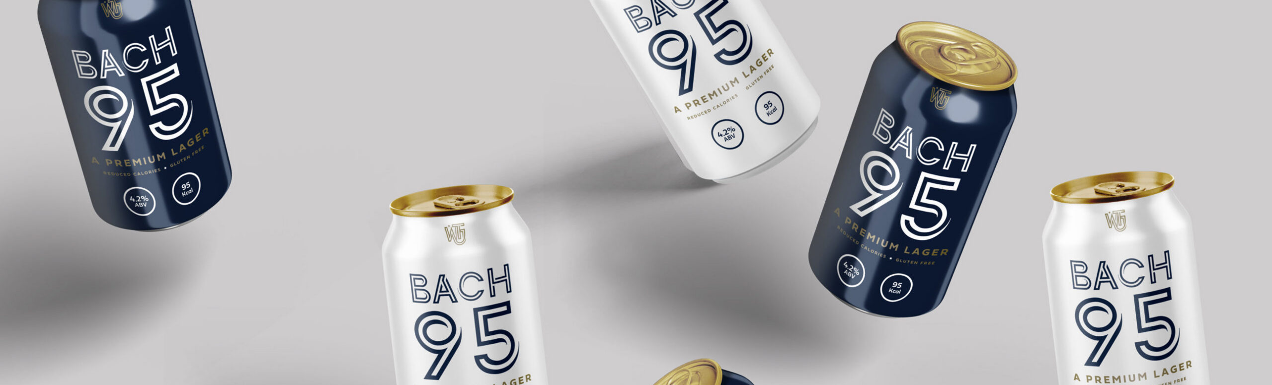
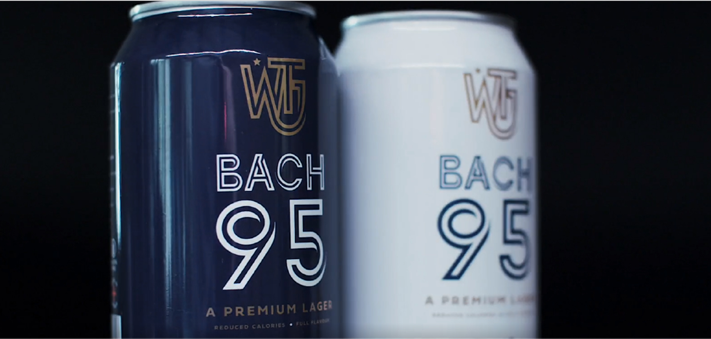
Bach 95 packaging design was developed to position the brand as a premium, low-calorie lager with a clean, sophisticated, and modern identity. The packaging needed to appeal to consumers who value taste, quality, and mindful lifestyle choices, while still feeling bold enough to stand out in a busy beverage market.
Mutatio created a refined packaging system that balanced simplicity with strong visual recognition. Through clean typography, restrained colour choices, and confident brand presentation, Bach 95 packaging design helped transform the product into a memorable and commercially effective brand experience.
The vision behind Bach 95 packaging design was to create a premium lager identity that felt fresh, confident, and health-conscious. The brand needed to communicate lightness and quality without feeling too clinical, plain, or overly functional.
As a low-calorie lager, the product was designed for consumers who want balance. They want a drink that feels enjoyable and sociable, but still fits into a more considered lifestyle. This meant Bach 95 packaging design needed to reflect both refreshment and sophistication.
Mutatio approached the project with three clear goals:
→ Encourage consumers to try the product through standout packaging
→ Increase the perceived value of the lager
→ Strengthen brand recognition across retail and digital touchpoints
By focusing on these goals, Bach 95 packaging design became a strategic tool for influencing first impressions and supporting long-term brand growth.
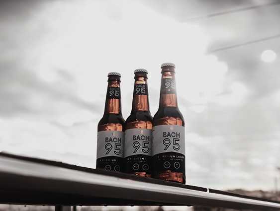
The visual strategy for Bach 95 packaging design focused on clarity, confidence, and minimalism. Instead of using heavy graphics or unnecessary decoration, the design relies on bold branding and a clean visual structure.
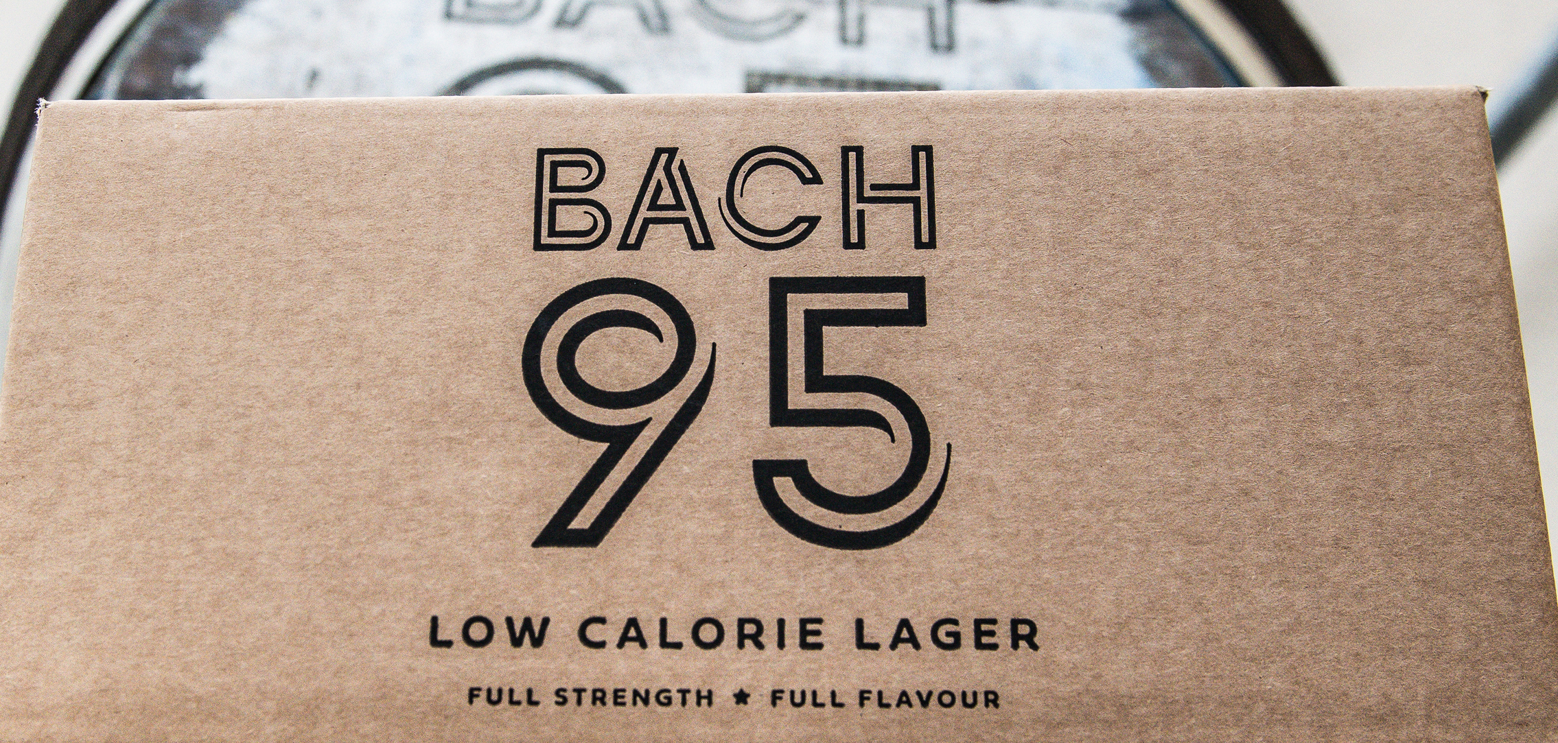
The large numerical identity creates a strong and memorable brand cue. This helps the packaging feel instantly recognisable, while the refined typography supports the premium positioning of the lager.
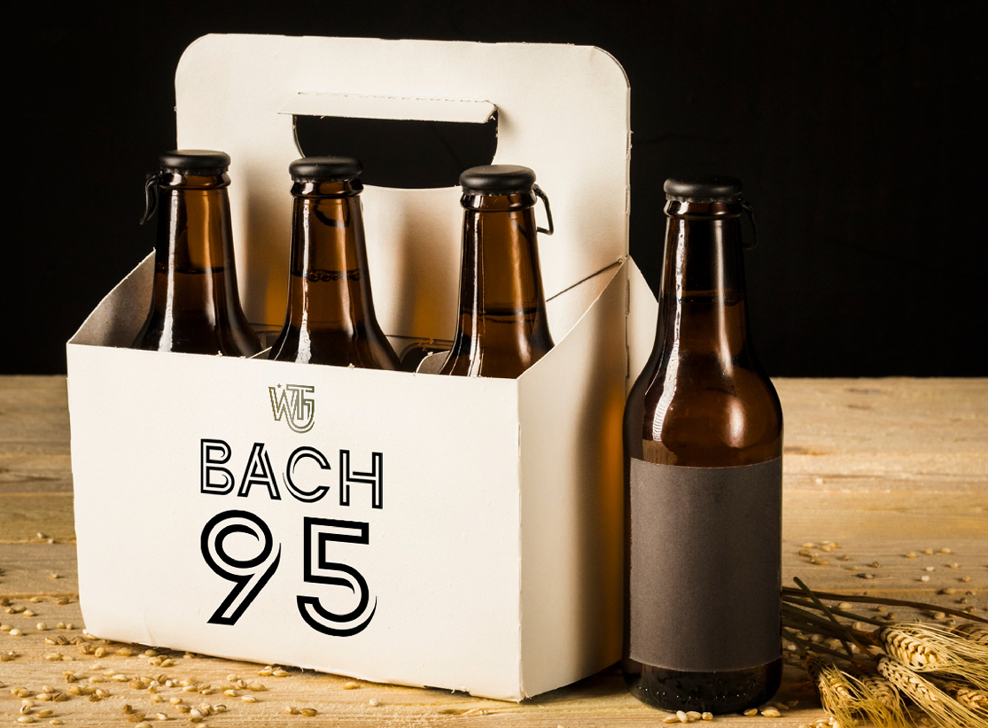
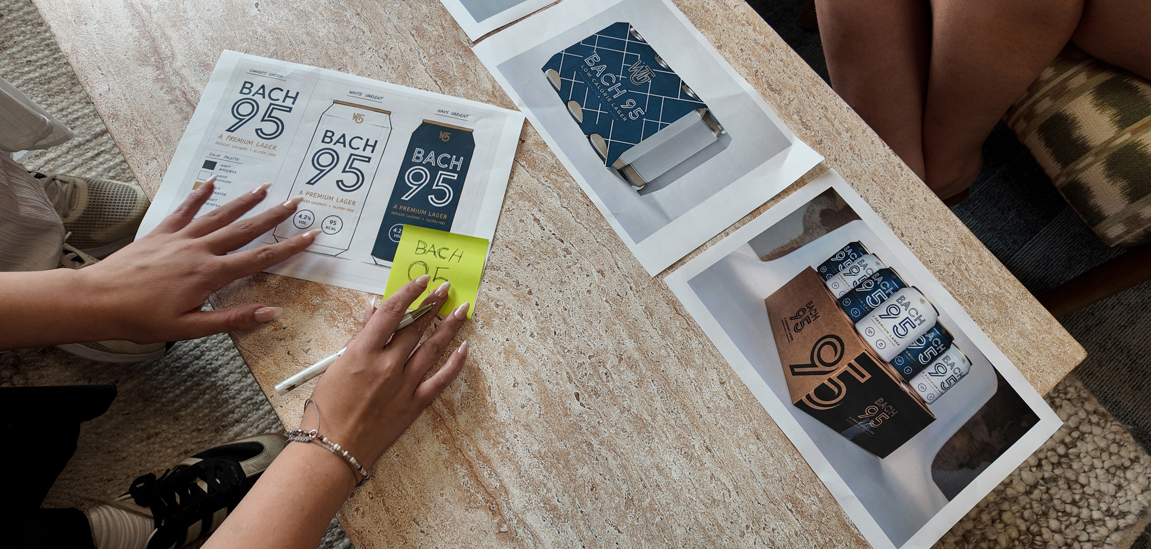
The bottle and carrier packaging work together as one cohesive system. The darker bottle glass creates a classic beverage feel, while the neutral carrier design adds a more modern and elevated appearance. This contrast allows Bach 95 packaging design to feel both established and contemporary.
Mutatio intentionally kept the design clean and uncluttered. This approach reflects the product itself: light, premium, and carefully crafted.
The visual strategy for Bach 95 packaging design focused on clarity, confidence, and minimalism. Instead of using heavy graphics or unnecessary decoration, the design relies on bold branding and a clean visual structure.
The large numerical identity creates a strong and memorable brand cue. This helps the packaging feel instantly recognisable, while the refined typography supports the premium positioning of the lager.
The bottle and carrier packaging work together as one cohesive system. The darker bottle glass creates a classic beverage feel, while the neutral carrier design adds a more modern and elevated appearance. This contrast allows Bach 95 packaging design to feel both established and contemporary.
Mutatio intentionally kept the design clean and uncluttered. This approach reflects the product itself: light, premium, and carefully crafted.
In the alcoholic beverage sector, packaging often determines whether a customer notices a product for the first time. A strong design can create curiosity, communicate value, and encourage trial before the consumer has tasted the drink.
Bach 95 packaging design was created to capture attention quickly while still feeling refined. The confident logo placement and minimal visual direction help the product stand out without appearing loud or over-designed.
This was especially important for a premium low-calorie lager. The packaging needed to suggest freshness, quality, and lifestyle appeal at the same time.
These results demonstrate how Bach 95 packaging design helped influence consumer behaviour, improve perception, and create stronger brand recall.
One of the strongest elements of Bach 95 packaging design is its balance between simplicity and premium appeal. The design avoids clutter and instead focuses on confident visual hierarchy, clean spacing, and a restrained aesthetic.
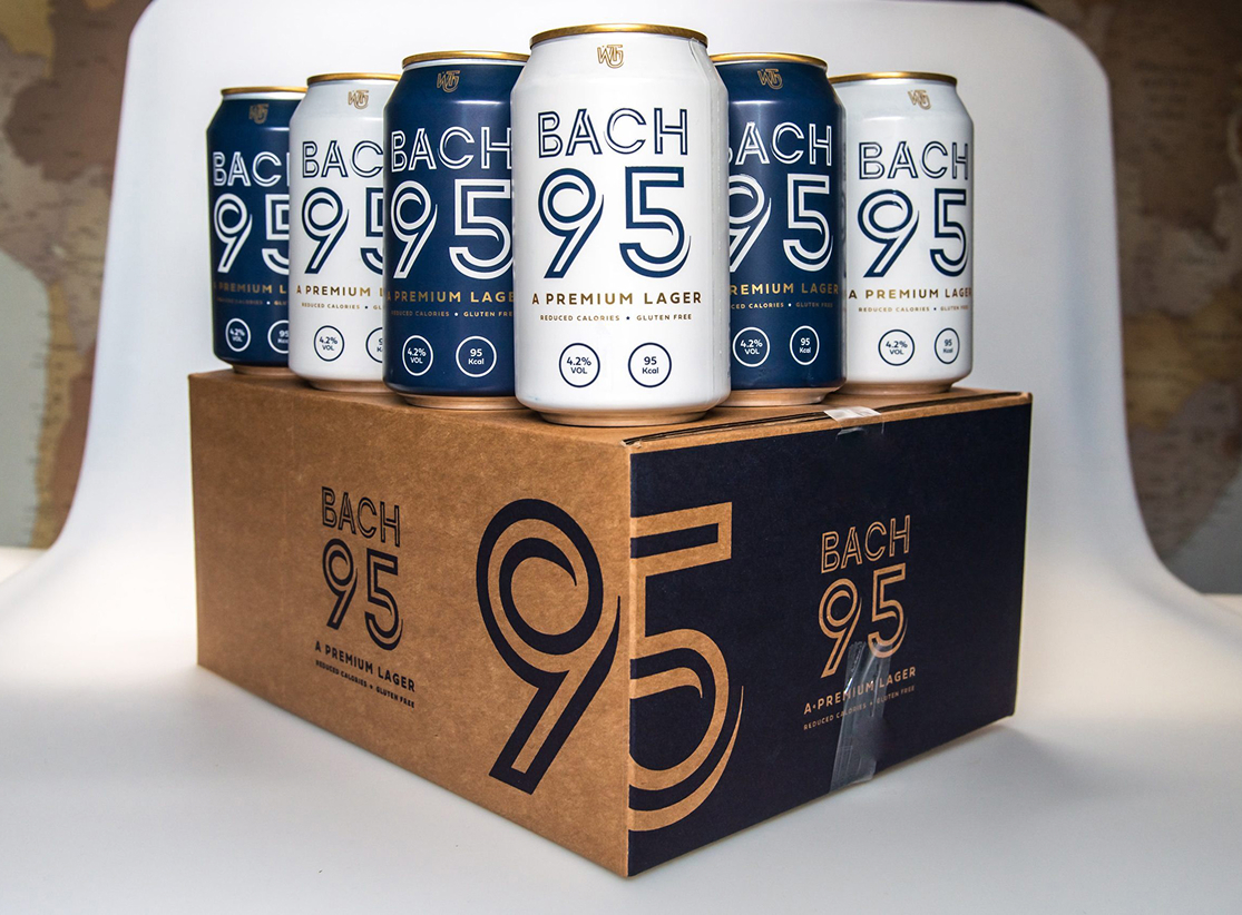
The packaging system uses:
→ Clean typography
→ Strong negative space
→ A refined colour palette
→ Bold but minimal brand presentation
→ Consistent application across bottle and carrier packaging
This gives the product a polished and sophisticated appearance while keeping the overall identity fresh and approachable.
In a market where many beverage brands compete for attention through bright colours and complex visuals, Bach 95 packaging design stands out by being more controlled and considered.
Shelf presence is one of the most important factors in beverage packaging. Consumers are often faced with a large number of similar products, so packaging needs to be easy to identify and remember.
Bach 95 packaging design achieves this through a strong typographic identity and a simple but distinctive layout. The large numerical branding gives the product a recognisable visual feature, making it easier for customers to remember after purchase.
Consistency was also a key part of the design approach. By applying the same identity across the bottle and carrier, Mutatio created a unified packaging system that supports stronger brand recognition over time.
This consistency helps Bach 95 packaging design perform across multiple settings, from retail shelves to lifestyle photography and online marketing.
Modern packaging is no longer just a functional requirement. It is also a brand communication tool, a social media asset, and a key part of the customer experience.
Bach 95 packaging design was created to support the brand across both physical and digital channels. The minimal design photographs well, feels premium in product imagery, and communicates the clean lifestyle positioning of the lager.
The packaging works as:
→ A brand recognition tool
→ A shelf-impact asset
→ A social media visual
→ A product storytelling platform
→ A premium positioning mechanism
Because the product is built around a modern lifestyle proposition, Bach 95 packaging design needed to feel suitable for retail, gifting, social occasions, and digital campaigns.
The final packaging solution helped position the brand as a distinctive premium lager with a clear and memorable identity. Through minimal design, refined typography, and strong brand consistency, Bach 95 packaging design gave the product a stronger commercial presence.
The project demonstrates how thoughtful packaging can:
→ Encourage first-time product trial
→ Increase perceived product value
→ Improve brand recognition
→ Strengthen shelf presence
→ Support a premium lifestyle identity
→ Create a consistent brand experience
Most importantly, Bach 95 packaging design helped the product feel more desirable, more professional, and more aligned with the expectations of today’s health-conscious consumer.
Packaging is one of the most influential tools in modern beverage branding. It shapes perception, builds recognition, and helps customers decide whether a product feels right for them.
Through a clean, confident, and premium visual system, Bach 95 packaging design helped communicate the brand’s quality, freshness, and lifestyle appeal.
This project highlights the value of strategic packaging: creating design that not only protects and presents a product, but also influences purchasing behaviour, strengthens identity, and supports long-term brand growth.