In the healthcare and wellbeing sector, packaging plays a vital role in shaping customer confidence. For medical-led brands, packaging must do more than look attractive. It needs to communicate safety, professionalism, trust, and product quality from the first interaction.
SlimCare packaging design was developed to support a healthcare brand focused on medically guided weight management and wellbeing services. The packaging needed to feel clean, calm, and credible while remaining approachable for customers exploring personal health and wellness solutions.

Mutatio created a refined packaging system that balanced medical professionalism with a softer, more human visual identity. Through clean structure, a calming colour palette, and clear brand presentation, SlimCare packaging design helped position the brand as trustworthy, supportive, and premium within the health and wellbeing space.
SlimCare Medical needed a packaging identity that reflected its role as a healthcare-led provider specialising in safe, evidence-based weight management support. The brand’s wider identity is built around trust, discretion, accessibility, and personalised care.
The vision behind SlimCare packaging design was to create packaging that reassured customers instantly. In a sector where people are making sensitive and personal decisions, every brand touchpoint needs to feel professional, calm, and reliable.
The packaging needed to communicate clinical credibility without feeling cold or intimidating. It had to feel clean and medical, while still carrying warmth and care. This meant SlimCare packaging design needed to strike a careful balance between authority and approachability.
Mutatio approached the project with three clear goals:
→ Build trust through clean and professional packaging
→ Increase perceived product safety and quality
→ Create a premium healthcare experience that felt calm and reassuring
By focusing on these goals, SlimCare packaging design became an important part of the customer journey, helping users feel confident in the brand before they even interacted with the product.
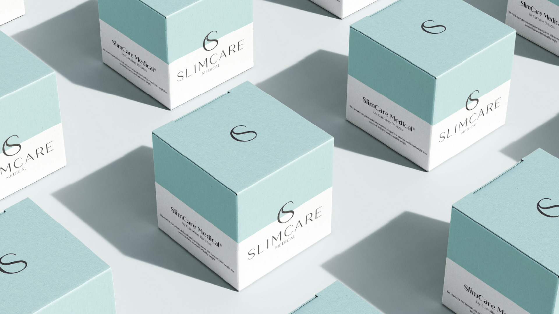
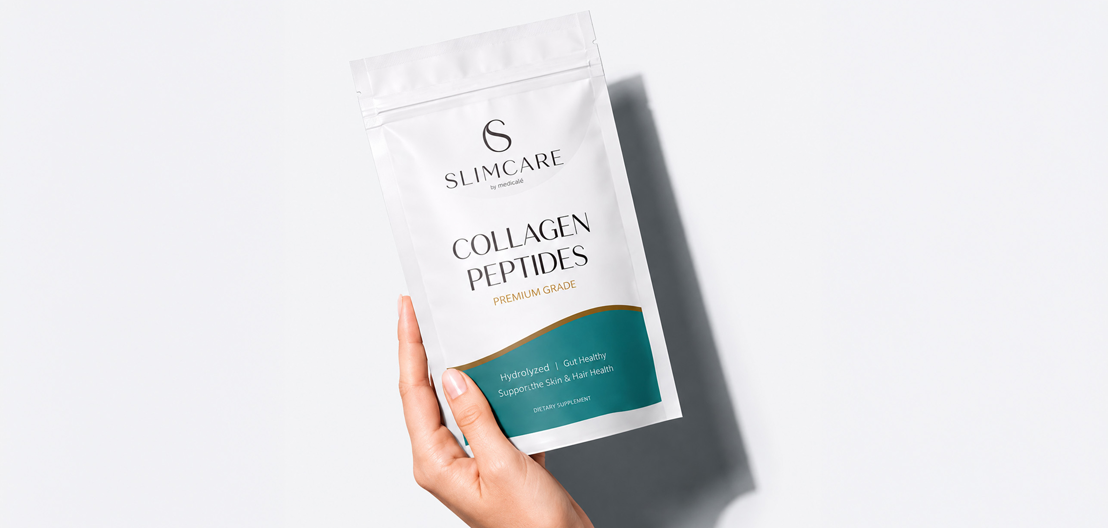
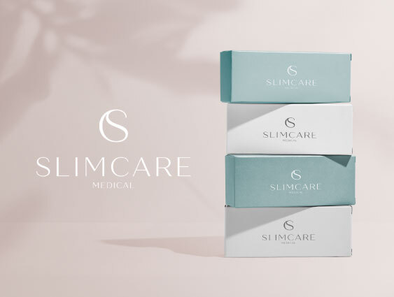
The visual strategy for SlimCare packaging design focused on clarity, simplicity, and reassurance. The packaging uses a clean white base combined with a soft blue-green tone, creating an immediate sense of calm, cleanliness, and medical credibility.
The structured box format gives the product a professional and reliable appearance, while the minimal layout ensures information feels clear and easy to understand. This is particularly important in healthcare packaging, where customers need to feel informed rather than overwhelmed.
The soft colour palette supports the brand’s wellbeing positioning. Rather than using harsh clinical colours, the design feels fresh, gentle, and supportive. This contrast allows SlimCare packaging design to communicate professionalism while still feeling approachable and human.
Typography also plays an important role. The clean, refined type helps reinforce trust and quality, while the simple brand mark adds recognition without creating unnecessary visual clutter.
In the medical and wellbeing sector, customers often look for signals of trust before making a purchase or enquiry. Packaging can strongly influence whether a product feels safe, credible, and worth investing in.
SlimCare packaging design was created to build confidence from the first visual interaction. The clean presentation, professional structure, and calm colour system help customers associate the product with safety, care, and quality.
This is especially important for a brand connected to medically supported weight management. Customers need reassurance that the brand is dependable, professional, and sensitive to their needs.
These results demonstrate how SlimCare packaging design helped strengthen customer perception, encourage trust, and support stronger commercial value.
One of the most important strengths of SlimCare packaging design is its ability to feel professional without appearing cold or overly clinical. Healthcare brands need to communicate authority, but they also need to make customers feel supported and understood.
Mutatio achieved this balance through a restrained and calming visual system. The packaging avoids unnecessary decoration and instead focuses on clean presentation, thoughtful spacing, and a soft colour palette.
The packaging system uses:
→ Clean typography
→ Soft medical-inspired colours
→ Strong white space
→ Clear brand hierarchy
→ Minimal and structured product presentation
This creates a packaging experience that feels premium, trustworthy, and easy to engage with.
In a market where customers are often comparing products based on credibility and reassurance, SlimCare packaging design stands out by feeling both professional and compassionate.
Trust is one of the most important factors in healthcare packaging. Customers need to feel that the product is safe, credible, and supported by a professional brand.
SlimCare packaging design achieves this through a clean and consistent visual identity. The soft blue-green colour creates a memorable brand cue, while the white base reinforces cleanliness and clarity. Together, these elements make the product feel dependable and easy to recognise.
Consistency was also central to the design approach. By applying the same calm and professional identity across the packaging, Mutatio created a unified brand experience that supports recognition and customer confidence.
This consistency helps SlimCare packaging design perform across multiple touchpoints, from physical packaging to product photography, website visuals, social media, and wider marketing materials.
Modern healthcare packaging needs to work beyond the product itself. It must support brand trust, customer education, digital presentation, and the overall perception of care.
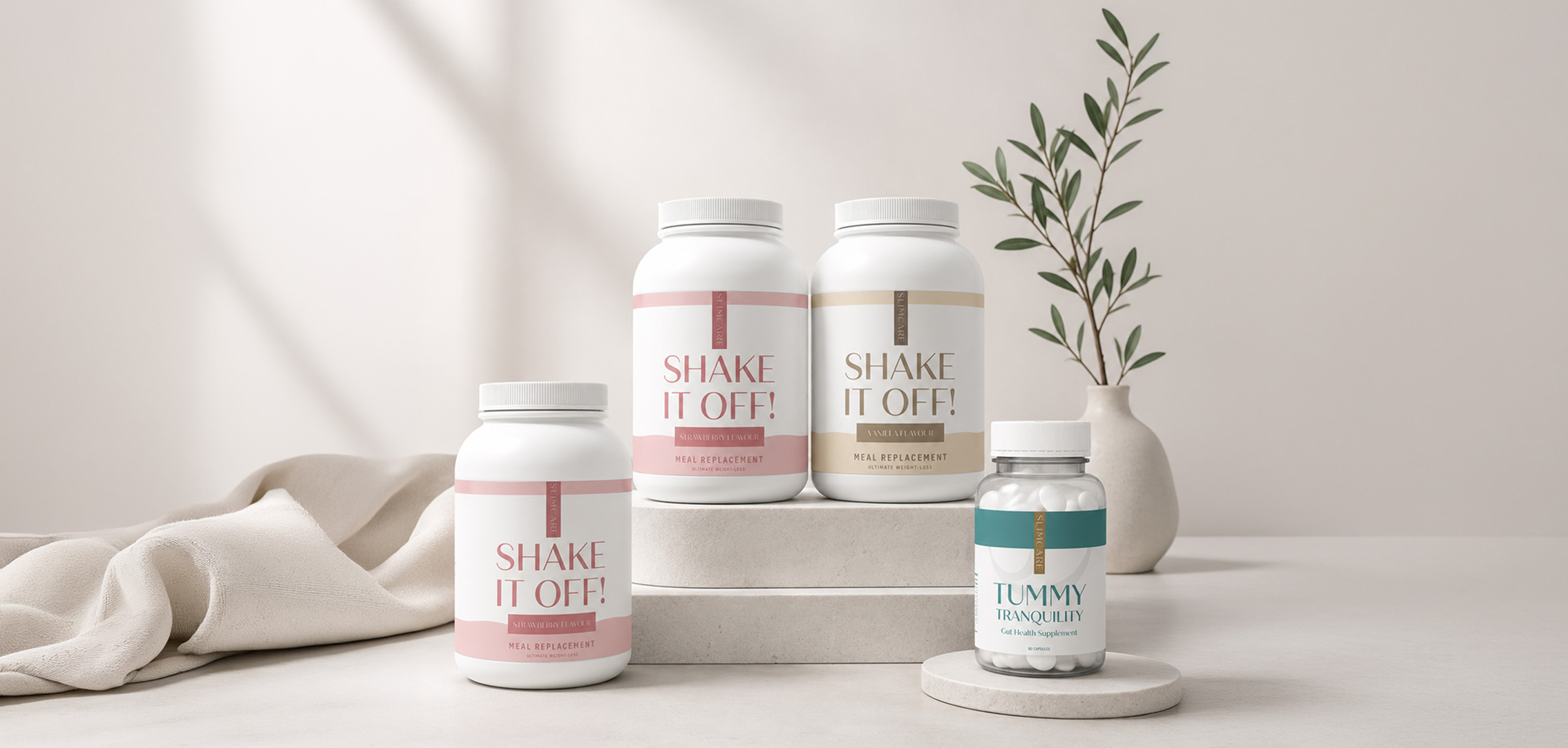
SlimCare packaging design was created to act as a brand asset across both physical and digital environments. The packaging photographs beautifully, looks clean in product imagery, and supports the brand’s calm and professional positioning.
The packaging works as:
→ A trust-building tool
→ A product safety signal
→ A premium brand asset
→ A clear communication platform
→ A visual extension of the healthcare experience
Because SlimCare Medical operates in a sensitive and personal sector, the packaging needed to feel considered at every level. SlimCare packaging design helps reassure customers that the brand is professional, supportive, and focused on quality care.
The final packaging solution helped position SlimCare Medical as a trusted and professional healthcare-led brand. Through clean design, soft colour direction, and clear visual structure, SlimCare packaging design gave the product a more premium and credible presence.
The project demonstrates how thoughtful healthcare packaging can:
→ Strengthen customer trust
→ Improve perceived product safety
→ Increase perceived product value
→ Support professional brand recognition
→ Create a calm and reassuring customer experience
→ Help customers feel confident in their purchasing decision
Most importantly, SlimCare packaging design helped the brand communicate care, credibility, and quality in a visually simple but powerful way.
Packaging is one of the most influential parts of healthcare branding. It shapes how customers judge safety, quality, and professionalism before they engage with the product or service.
Through a clean, calm, and professional visual system, SlimCare packaging design helped communicate the brand’s commitment to trust, wellbeing, and customer reassurance.
This project highlights the value of strategic healthcare packaging: creating design that not only presents a product beautifully, but also builds confidence, strengthens recognition, and supports long-term brand trust.